DEKALB BY PABLO A MEDINA
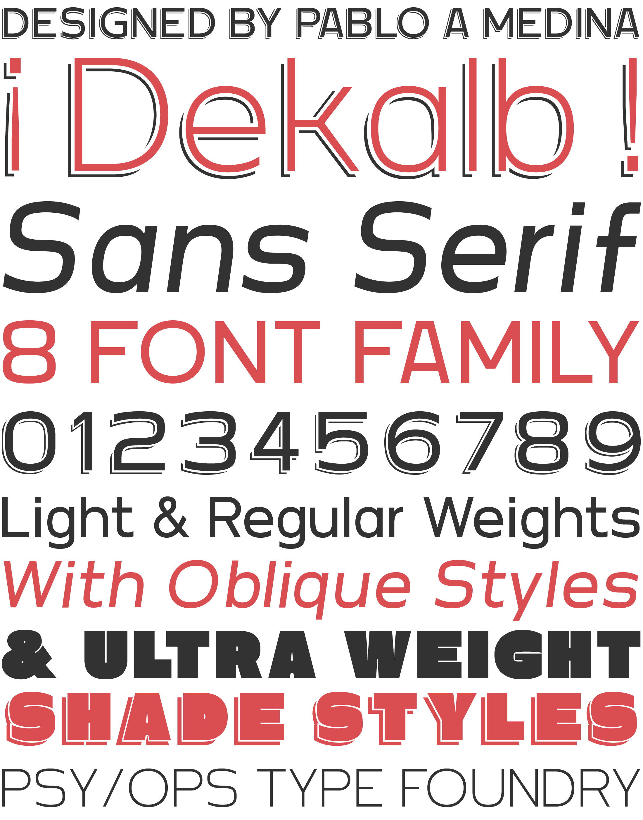
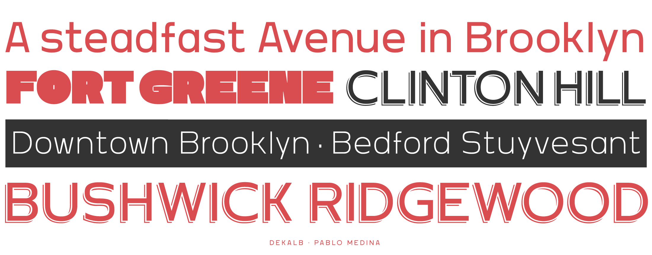
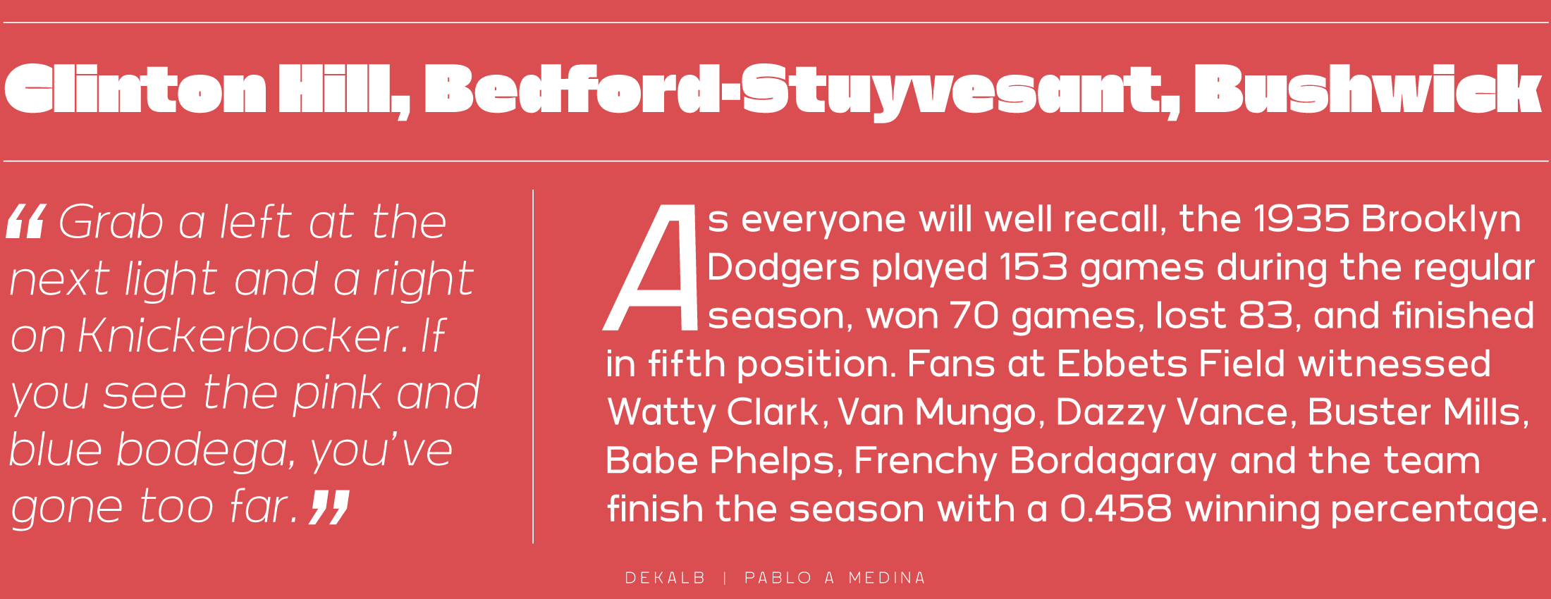
The Dekalb typeface was conceived of in 2013 after a day of photographing signage, murals and graffiti around Dekalb and Wyckoff avenues in Bushwick, Brooklyn. The initial drafts of the letterforms that were drawn that day eventually became Dekalb the typeface. —Pablo A Medina
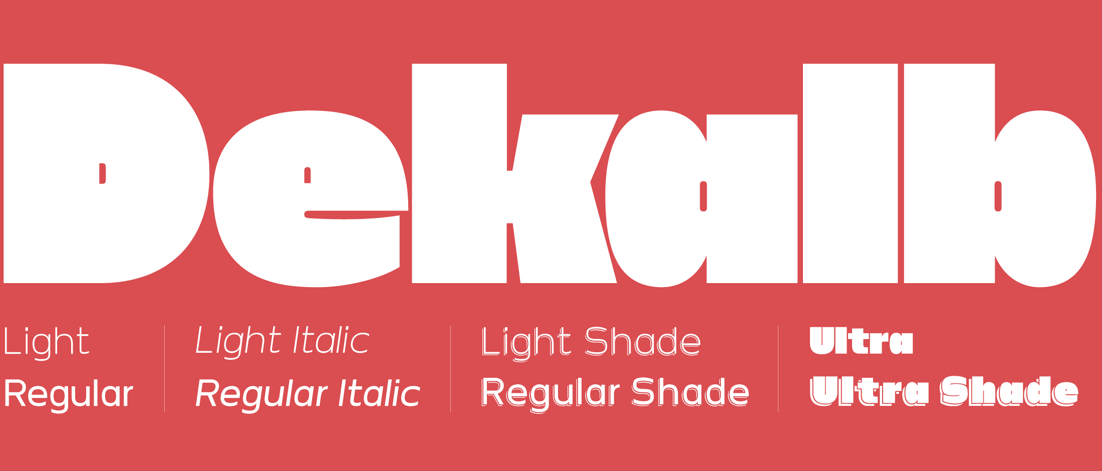
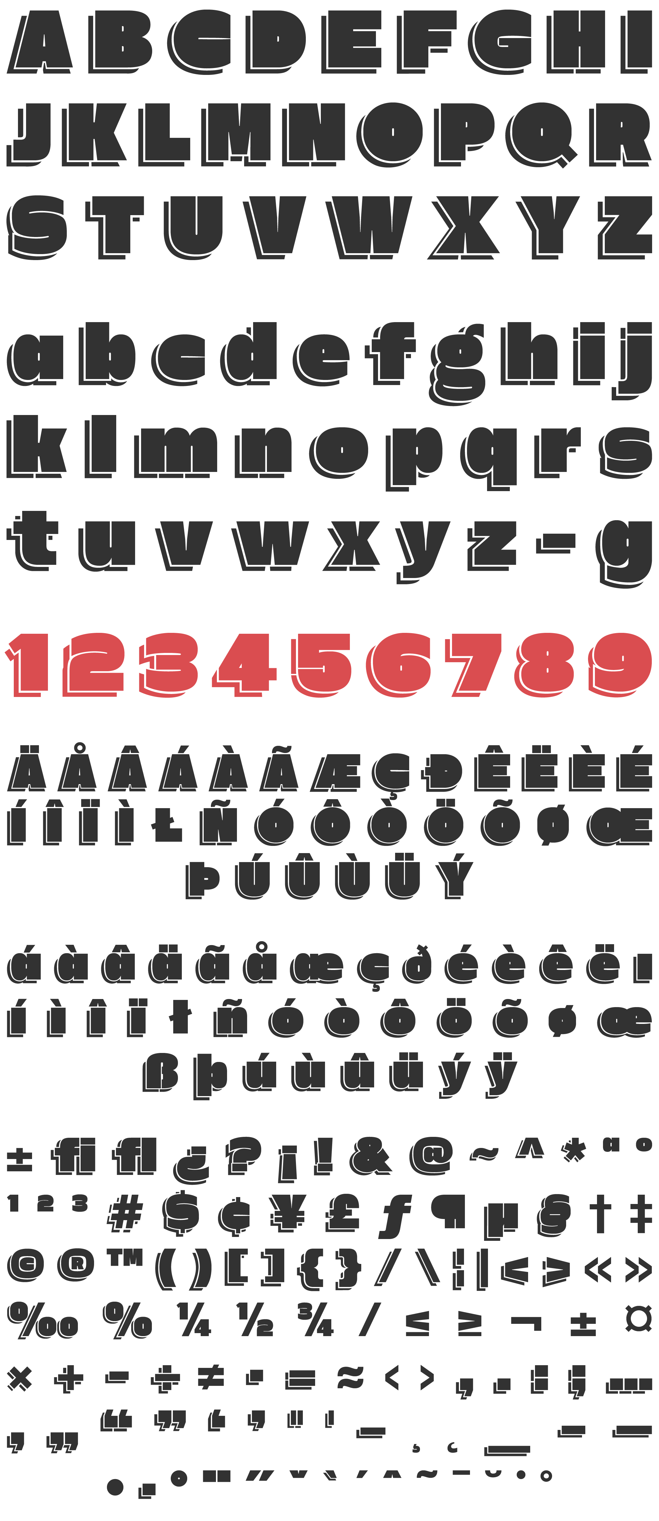
The Dekalb family features three weights: Light, Regular, and Ultra; with matching Oblique styles for the Light and Regular. A Shaded Display style is also available for the Light, Regular, and Ultra weights.
Each Dekalb font contains full Western European Character Sets, an Alternate “g,” and F Ligatures.

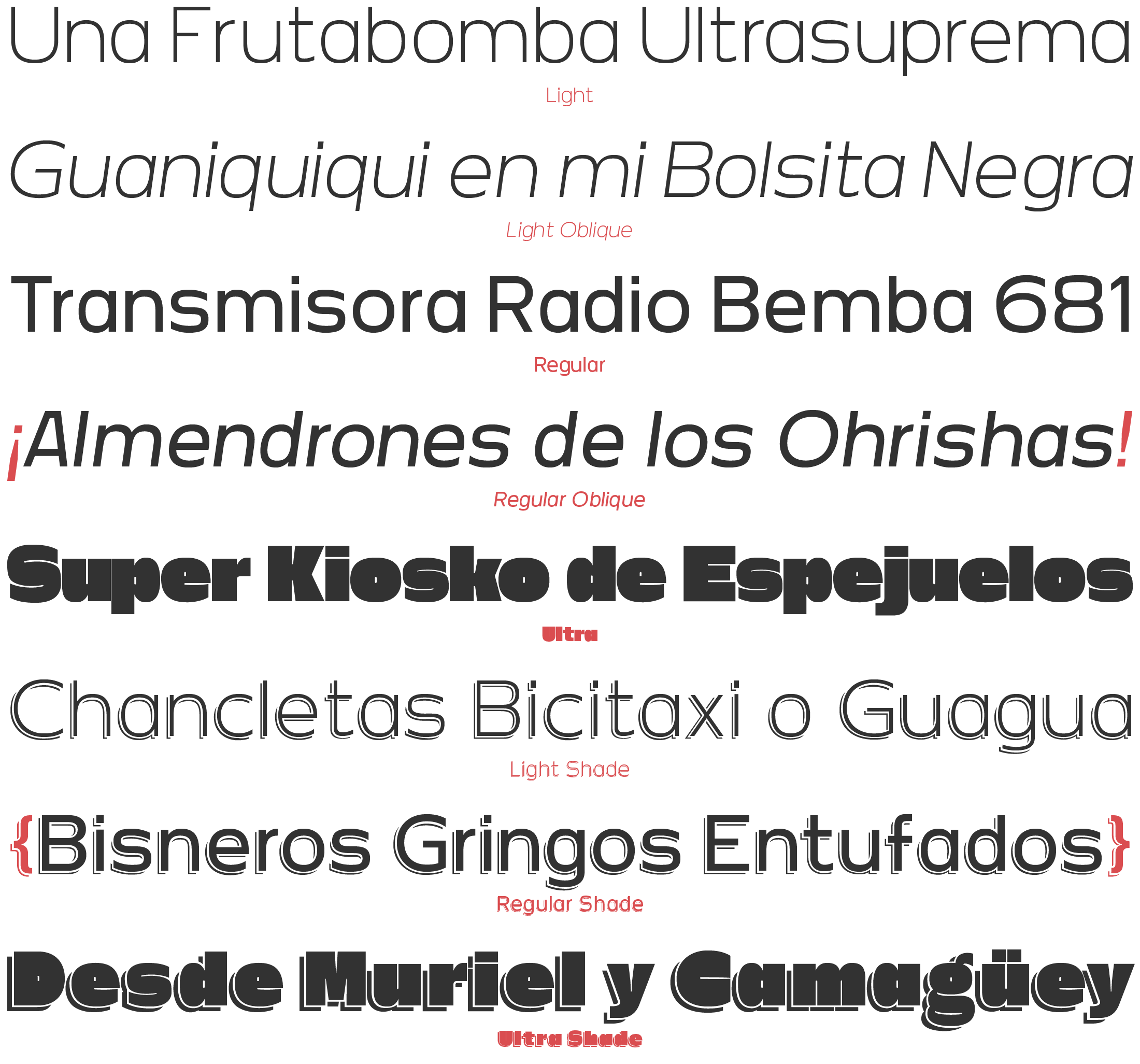
TYPE TESTER
The quick brown fox jumps over the lazy dog
DEKALB CHARACTER SET
DEKALB LIGHT
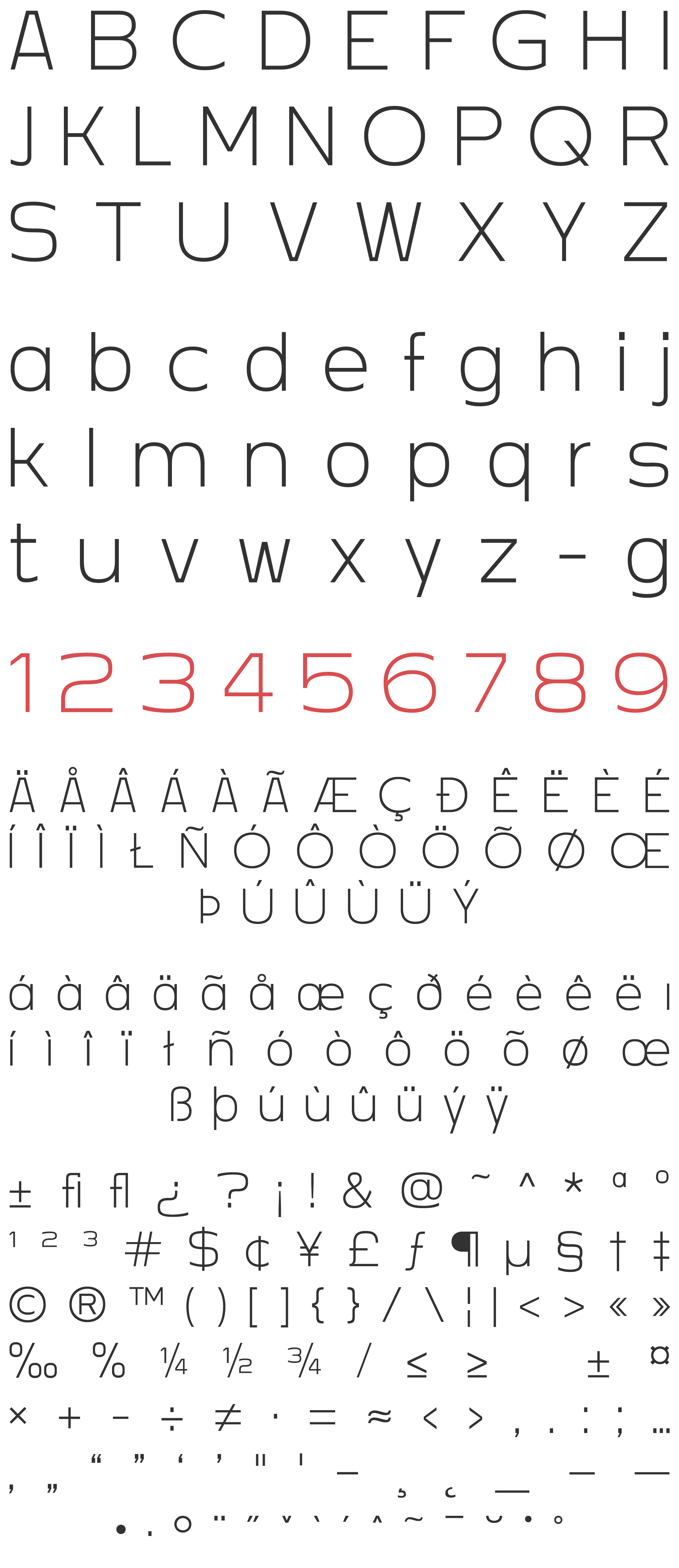
DEKALB LIGHT OBLIQUE
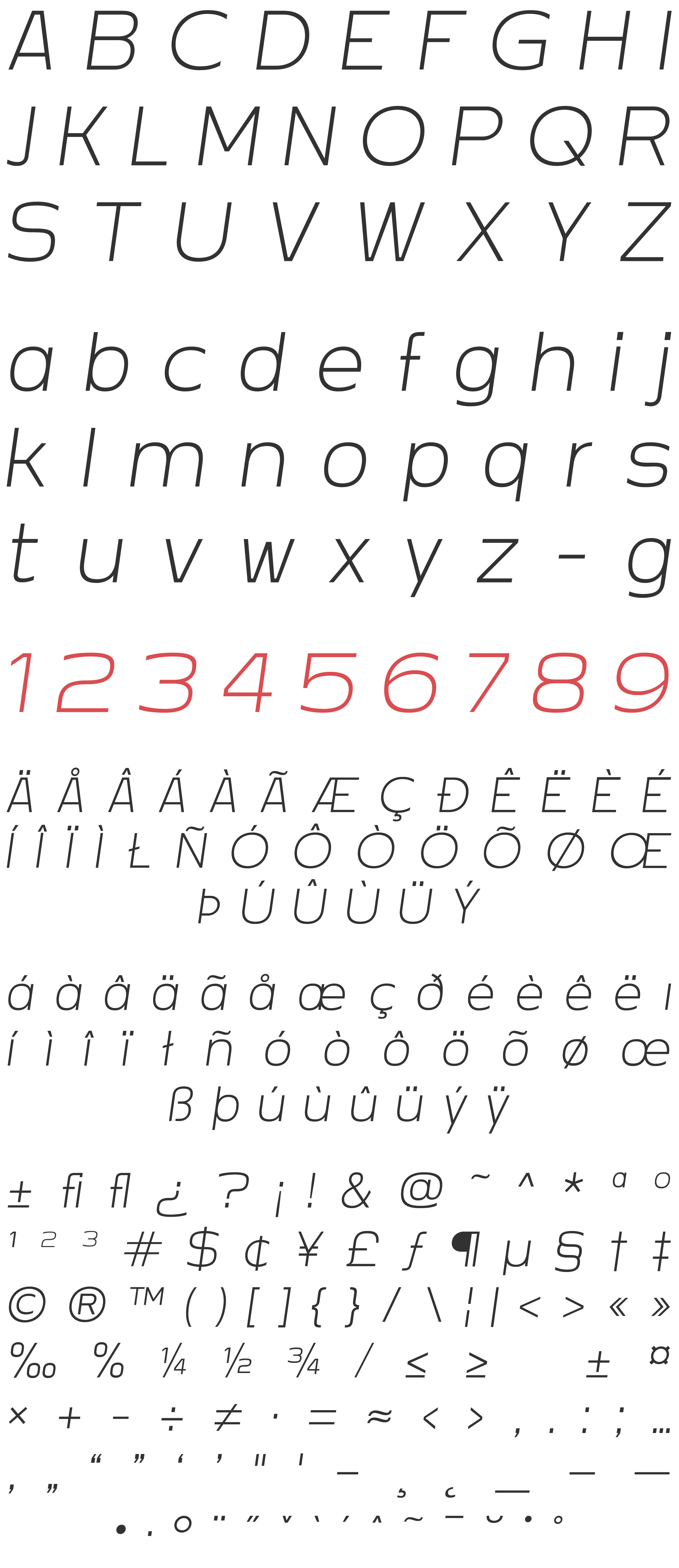
DEKALB REGULAR
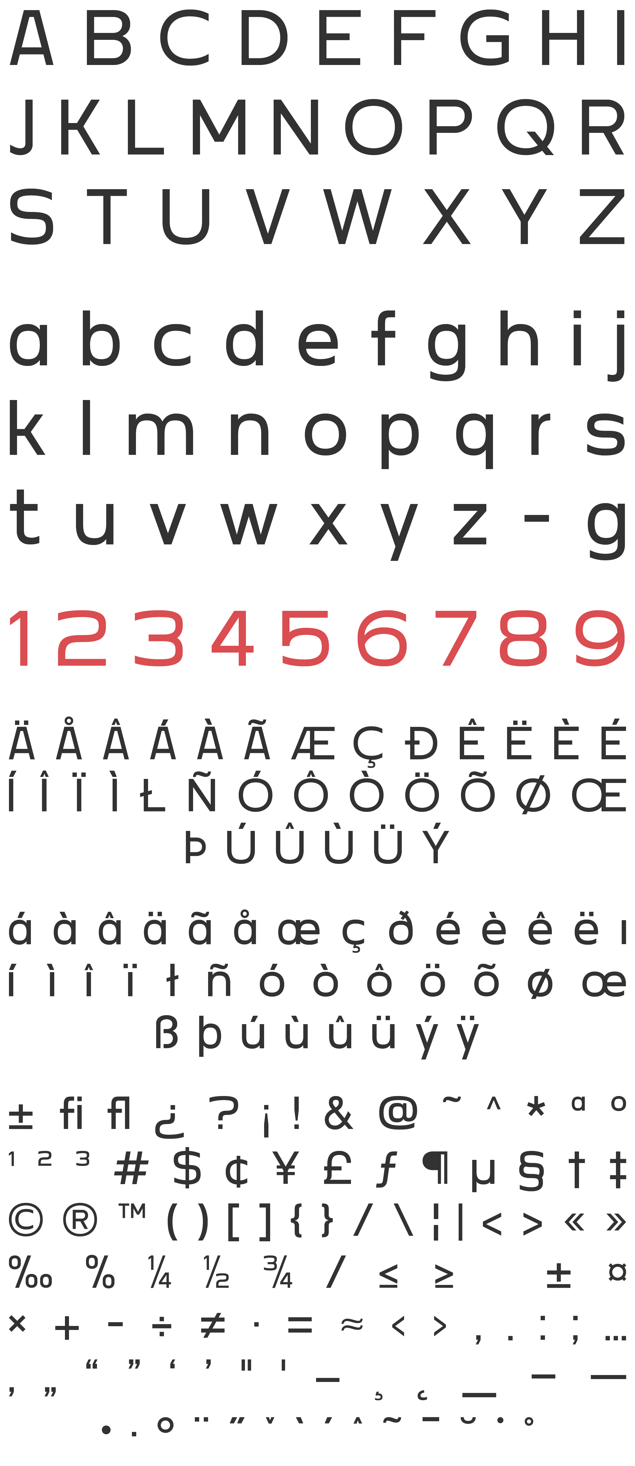
DEKALB REGULAR OBLIQUE
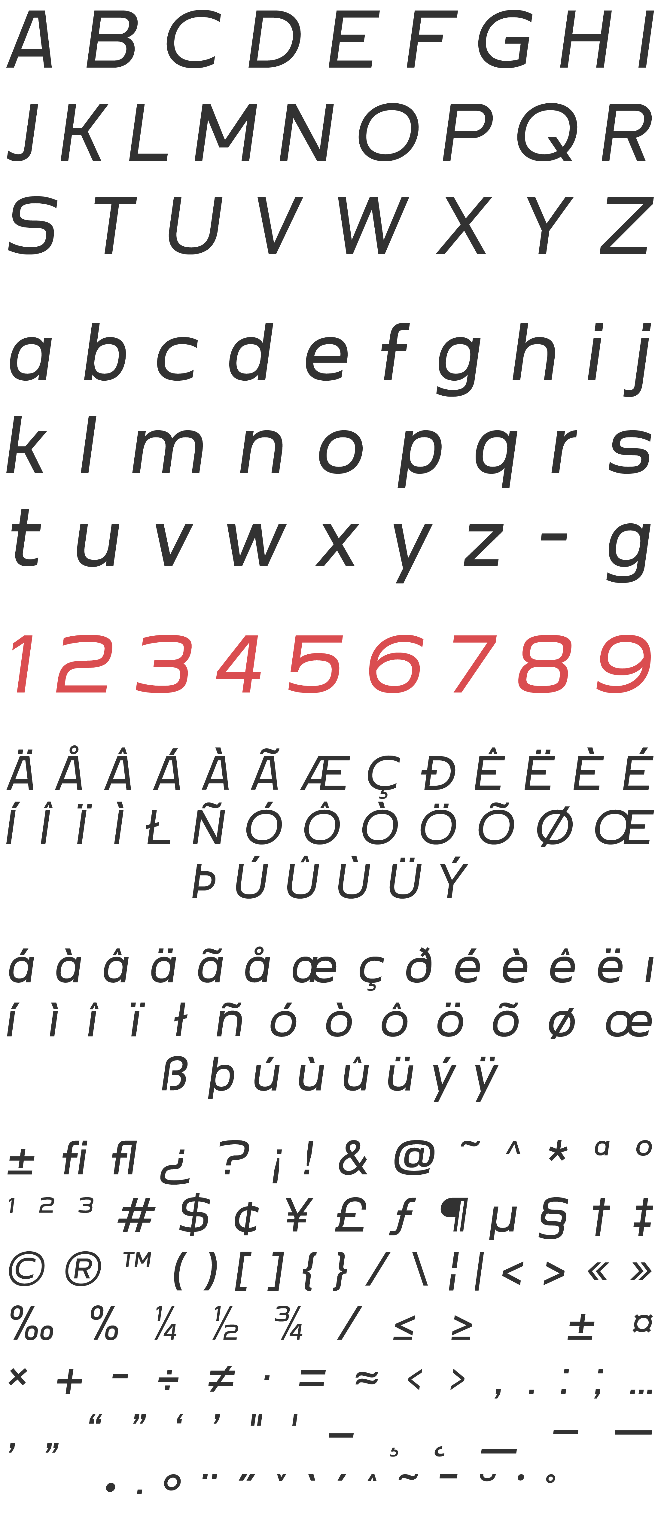
DEKALB LIGHT SHADE
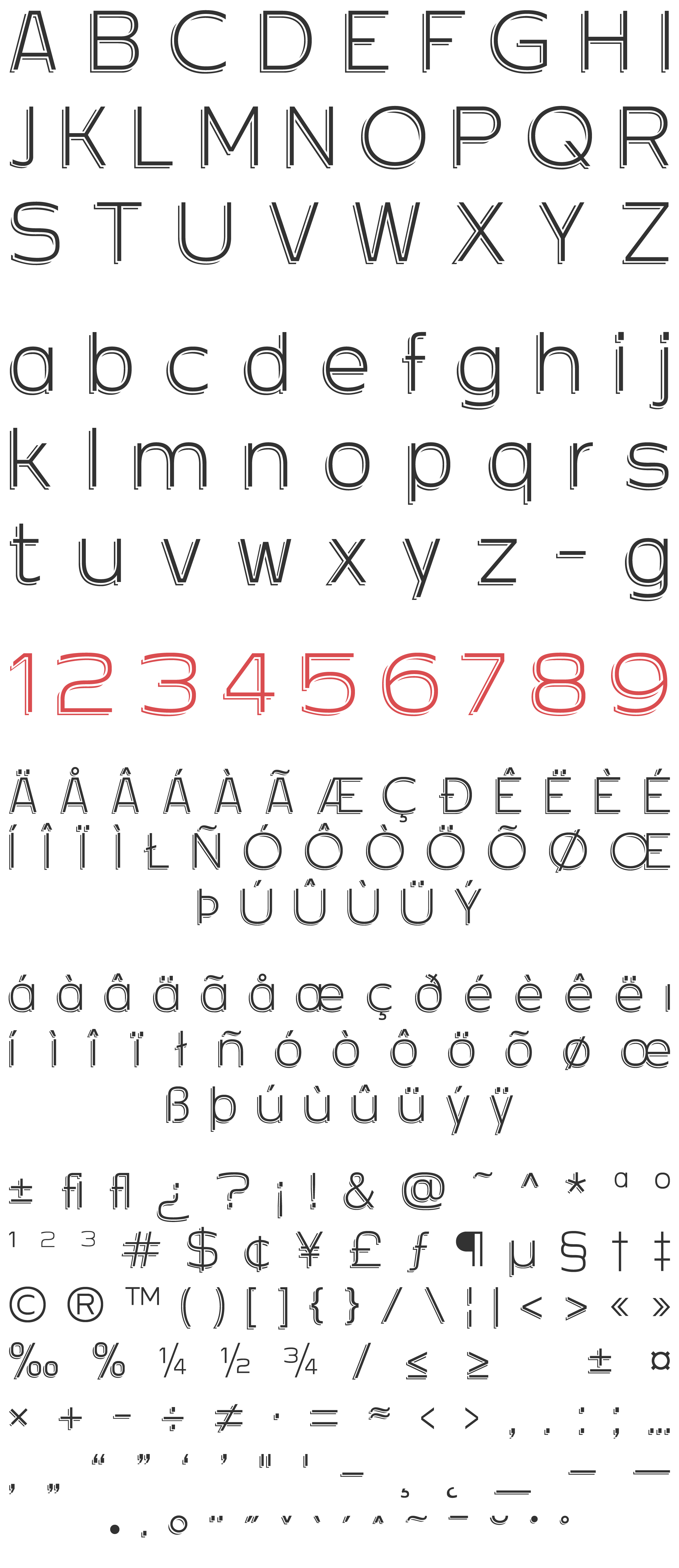
DEKALB REGULAR SHADE
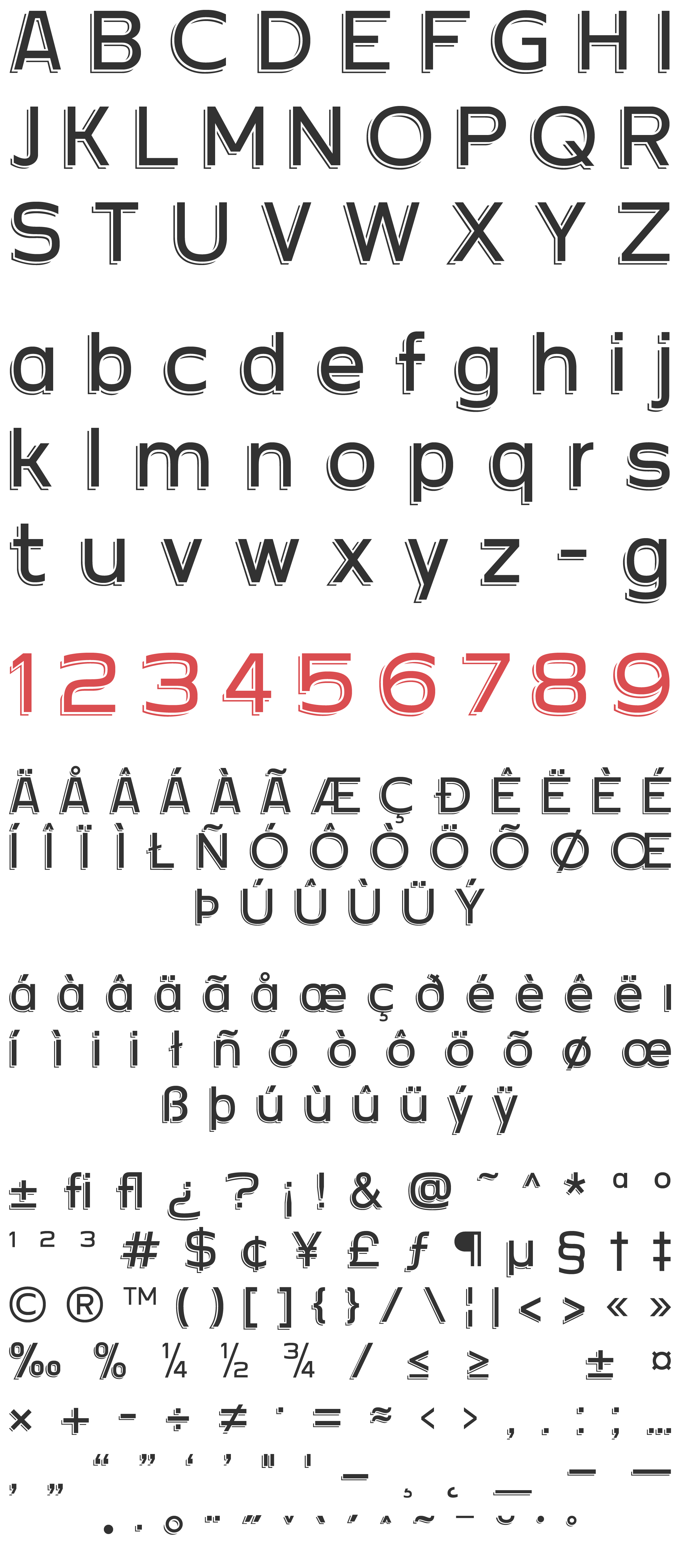
DEKALB ULTRA
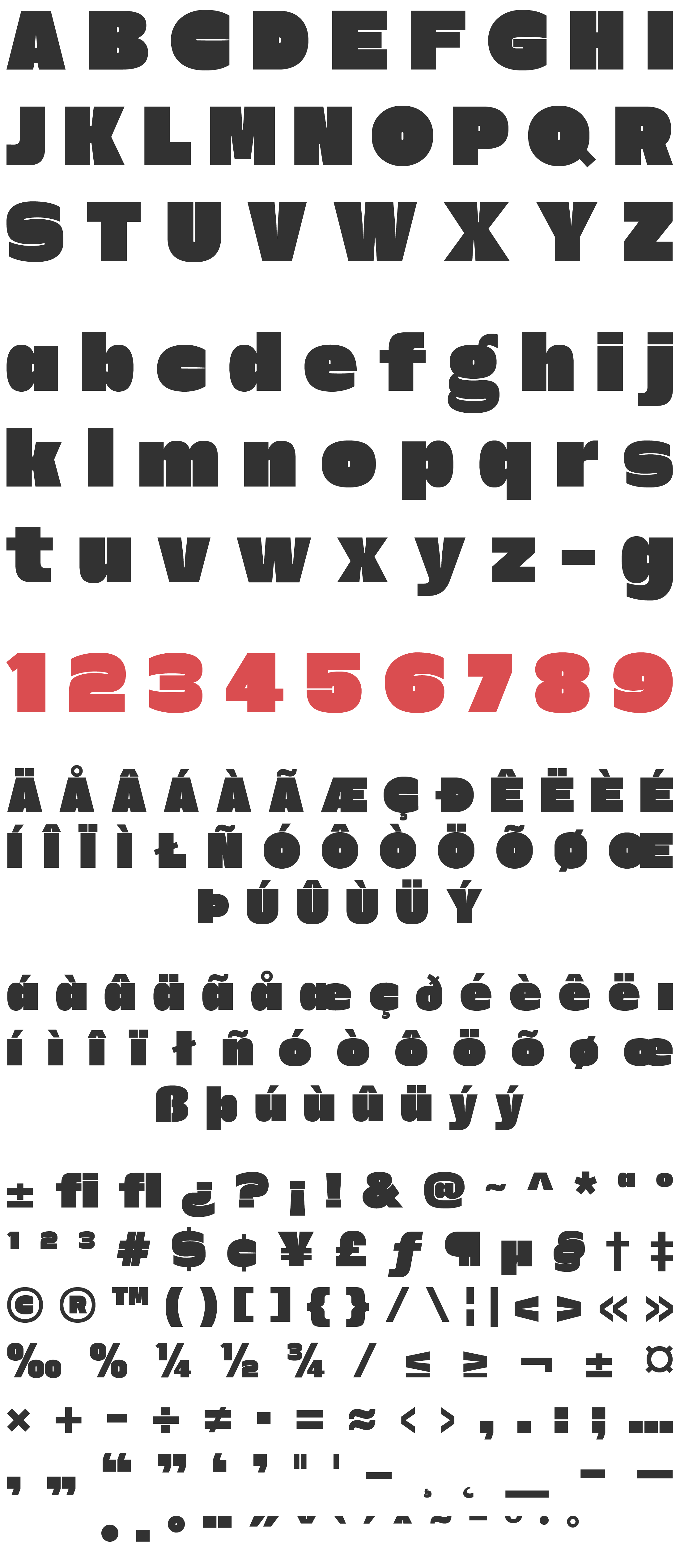
DEKALB ULTRA SHADE

FONT LICENSING
