
REYKJAVIK BY STEFAN KJARTANSSON
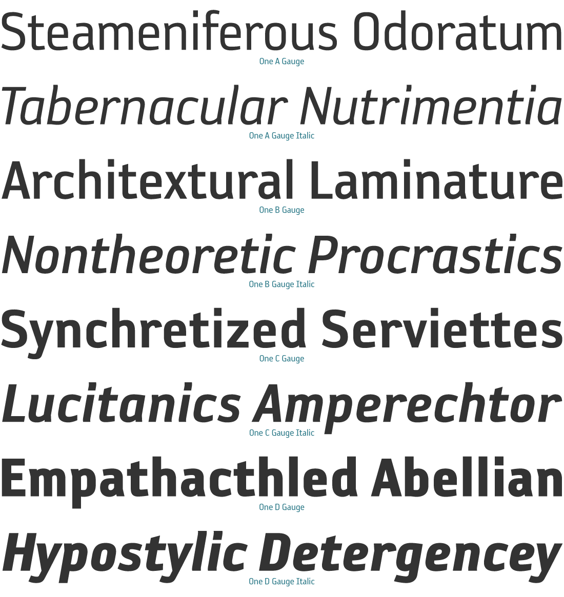
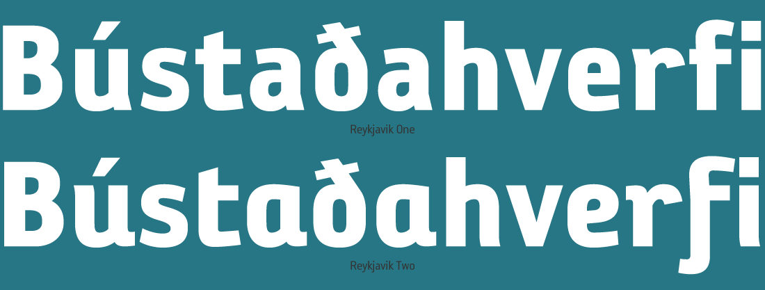
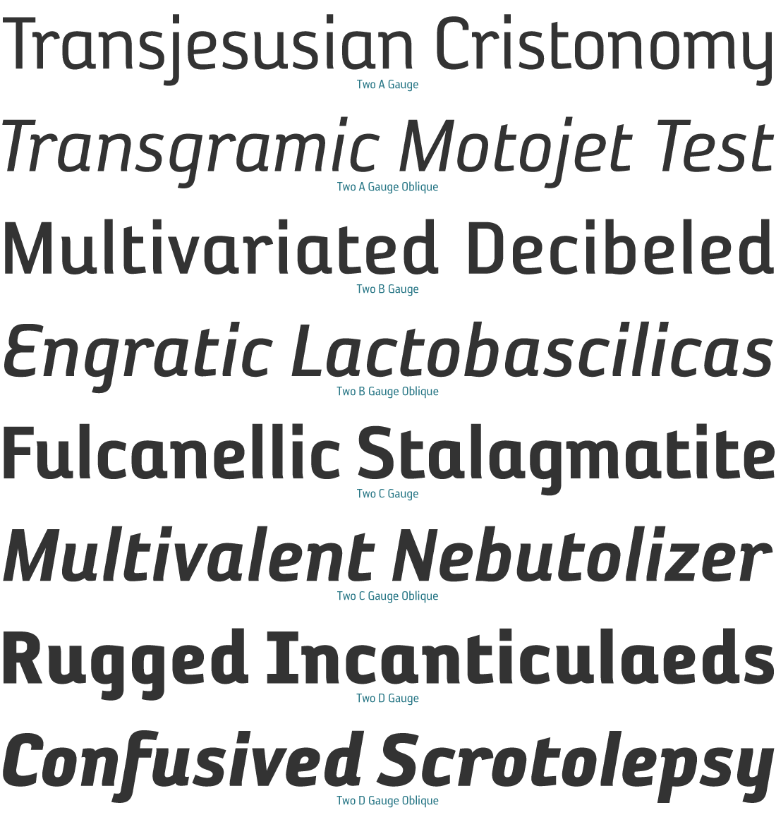
Two main styles of Reykjavik are available in this typeface. There is the One style. A versatile sans serif featuring a more standard design: such as fewer descenders, a double chamber “a”, and an open “C”. There is also the Two style. A modern friendlier design: with more descenders, a curvy “E”, a loop in the “k”, and a single chamber “a”.
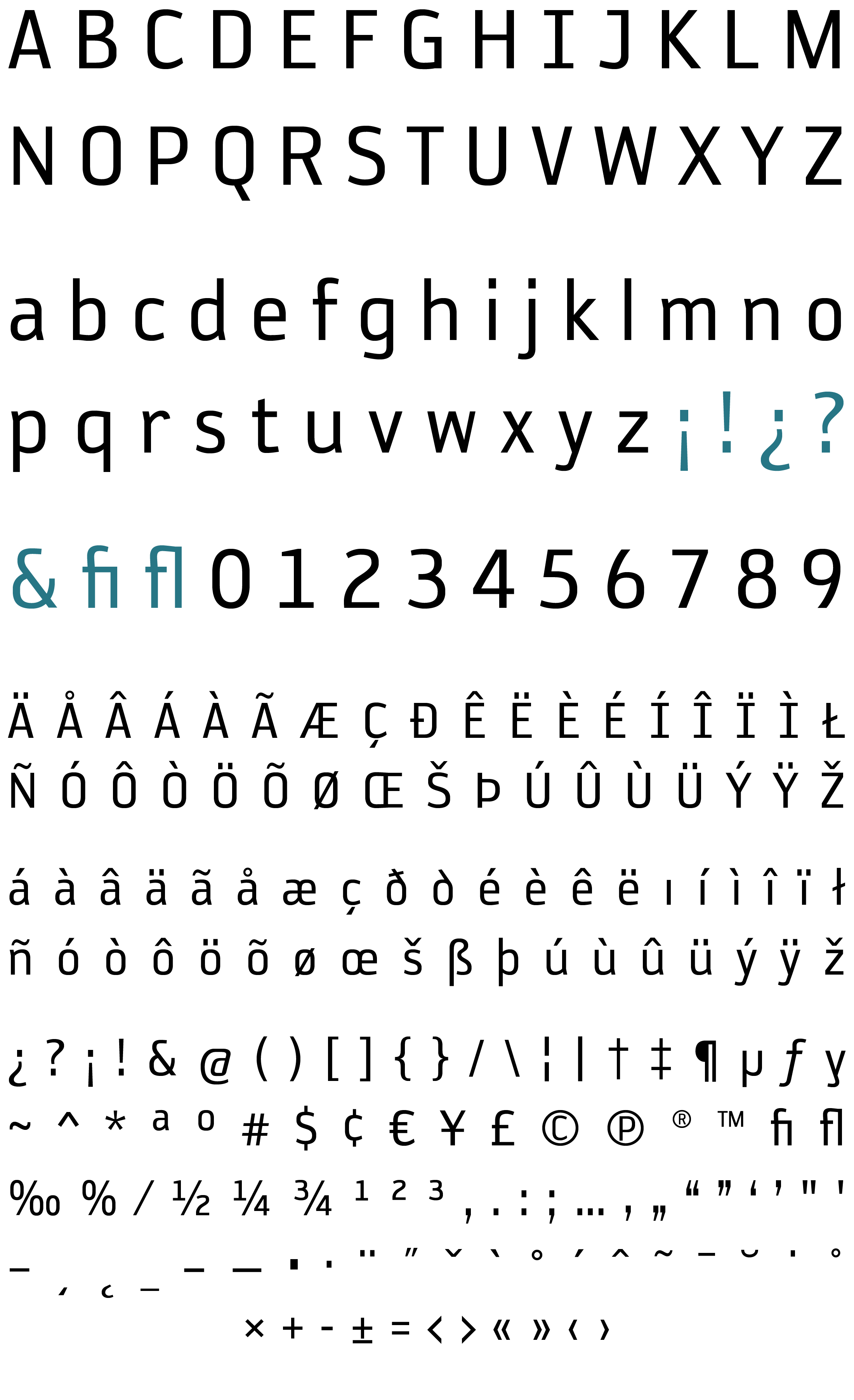
The Reykjavik fonts include: Western and Eastern European characters, ligatures, and more.
Reykjavik has two subsets available: One — which contains all of the A-D Gauge One style fonts, and Two — which contains all of the A-D Gauge Two style fonts.
© PSY/OPS 2001 Type Foundry


TYPE TESTER
The five boxing wizards jump quickly.
The five boxing wizards jump quickly.
REYKJAVIK ONE CHARACTER SET
REYKJAVIK ONE A GAUGE
REYKJAVIK ONE A GAUGE ITALIC
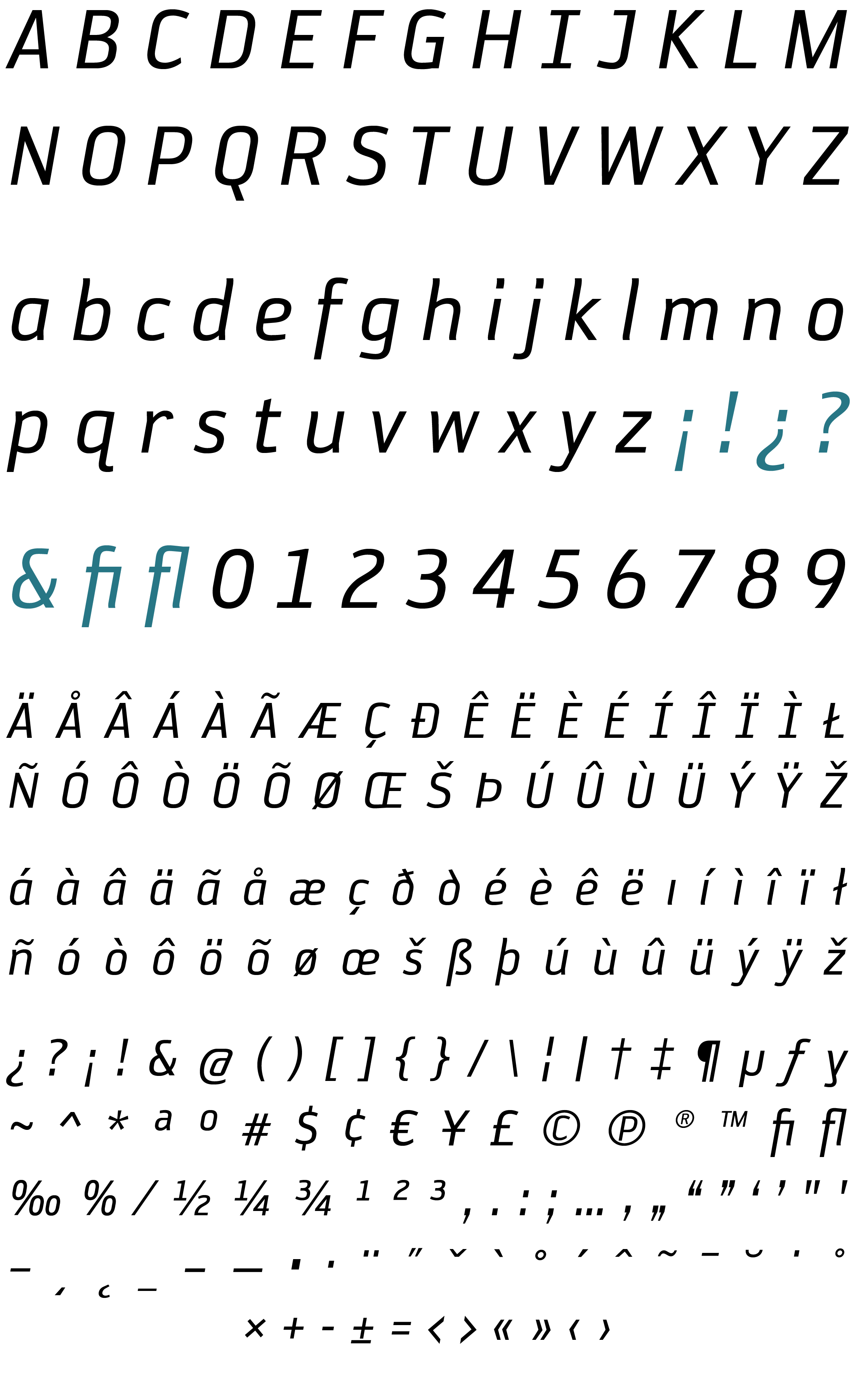
REYKJAVIK ONE B GAUGE
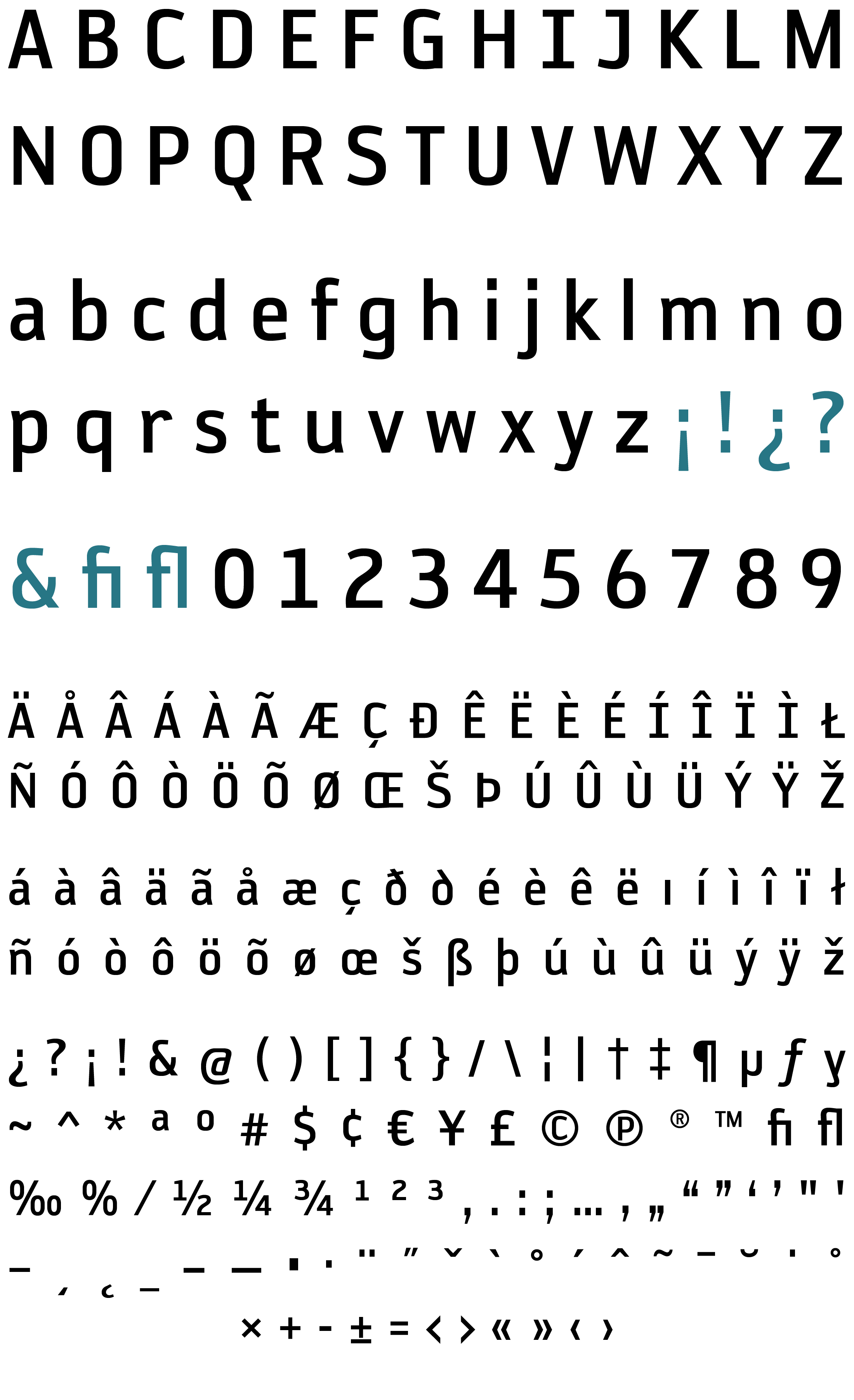
REYKJAVIK ONE B GAUGE ITALIC
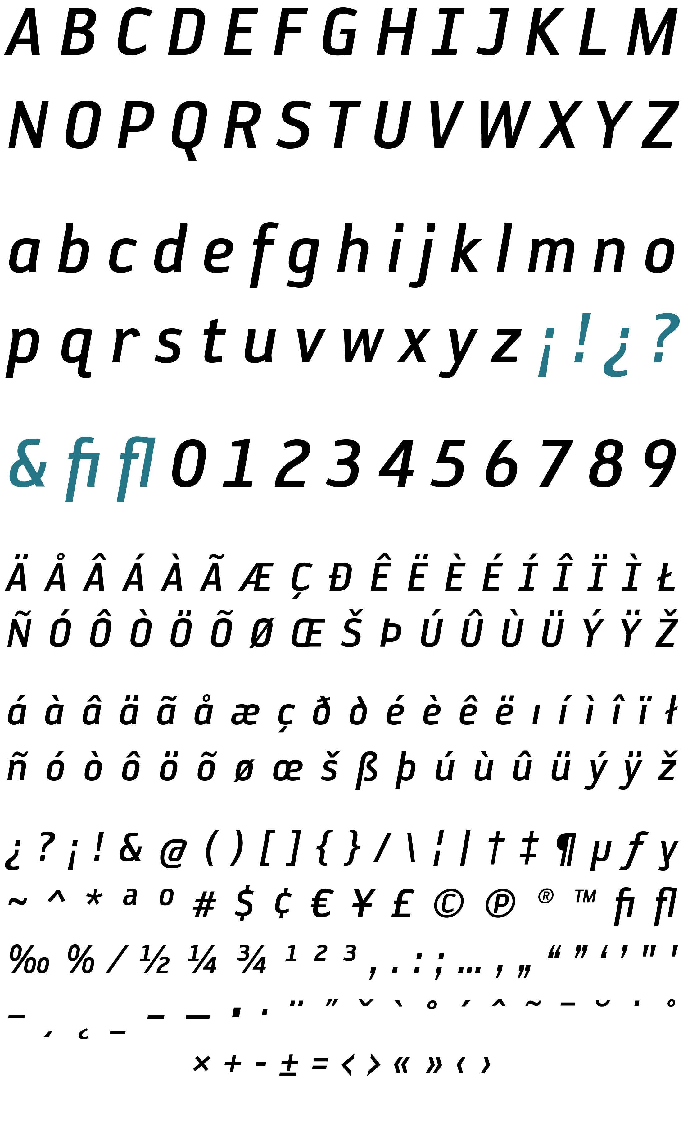
REYKJAVIK ONE C GAUGE
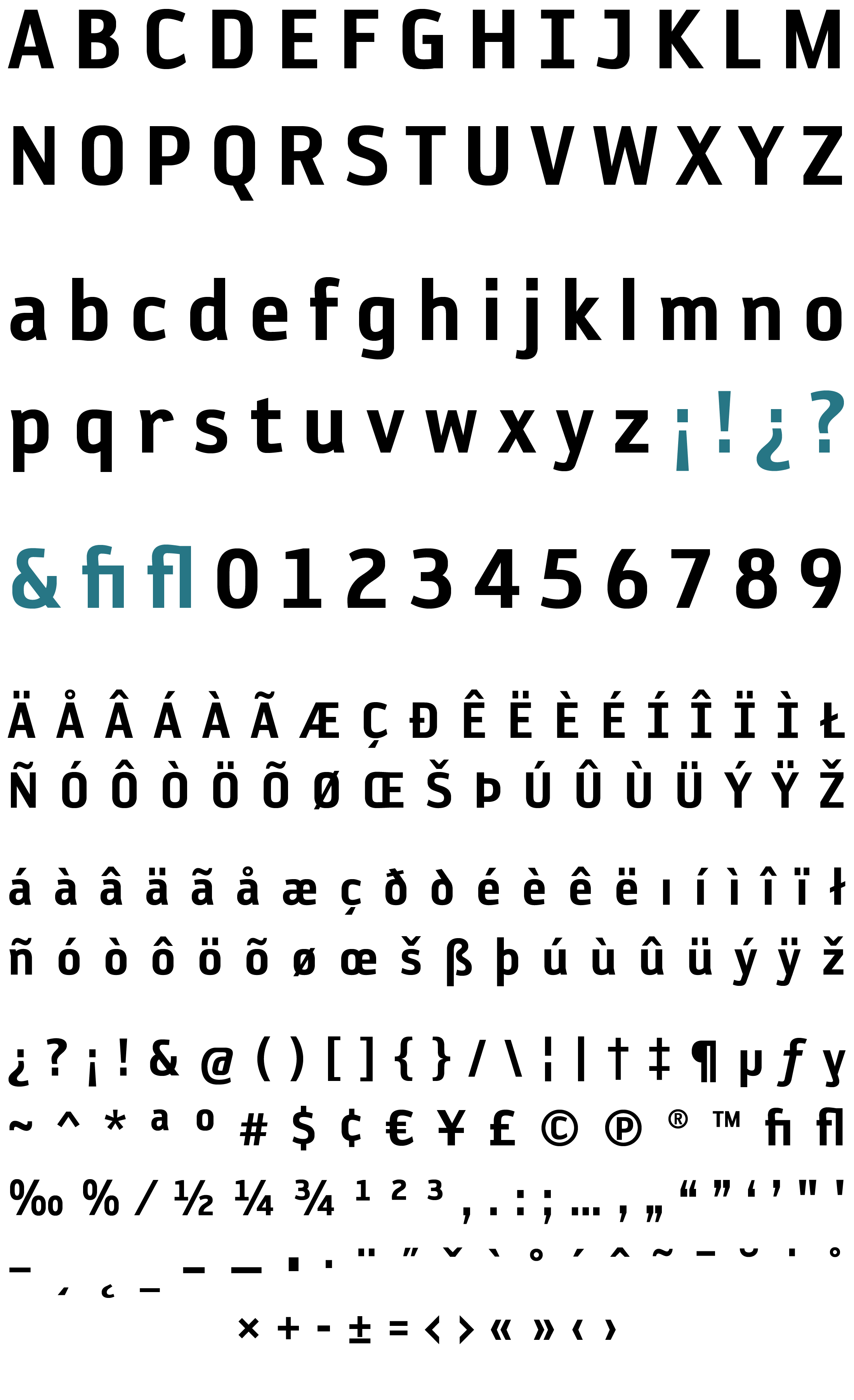
REYKJAVIK ONE C GAUGE ITALIC
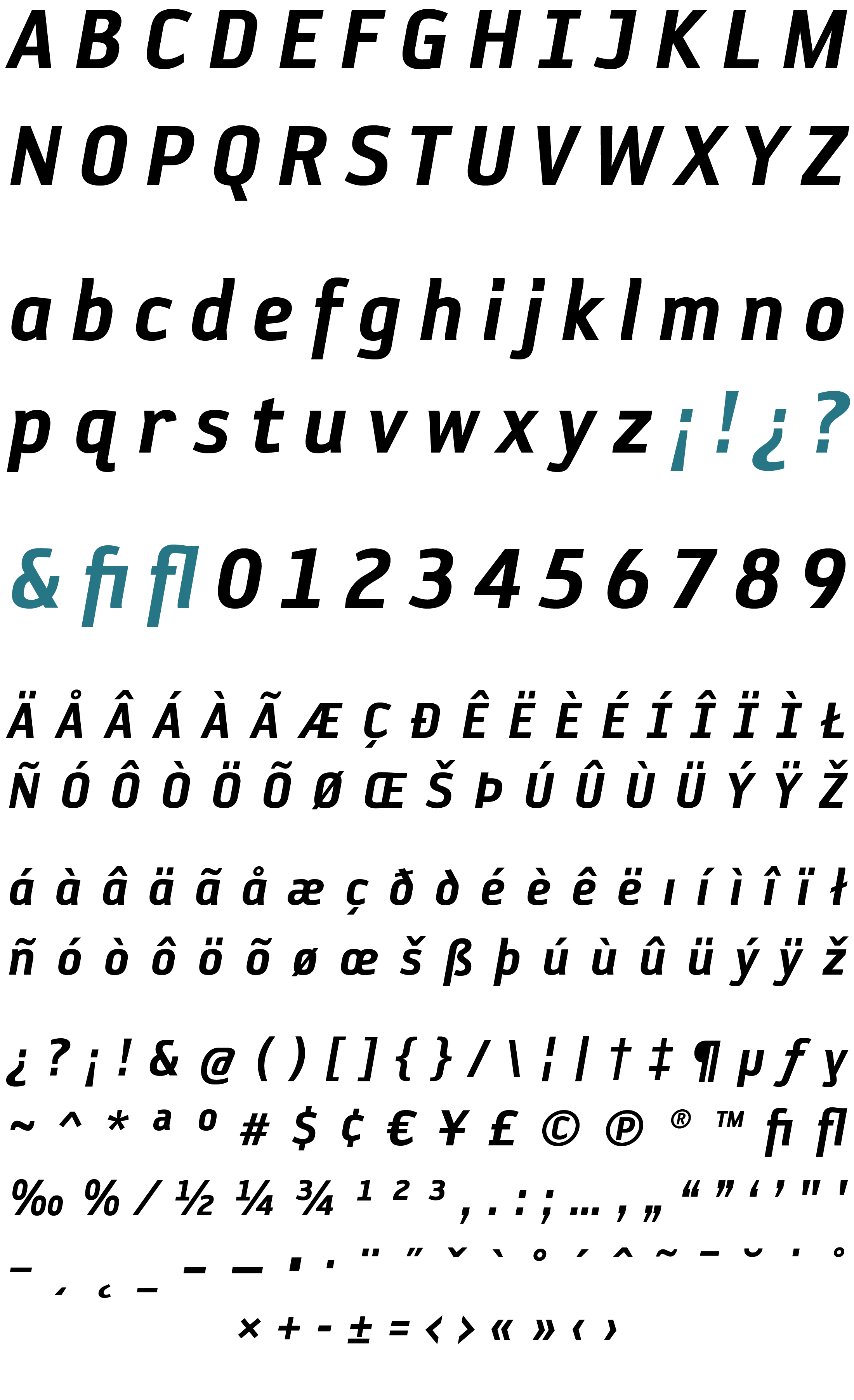
REYKJAVIK ONE D GAUGE
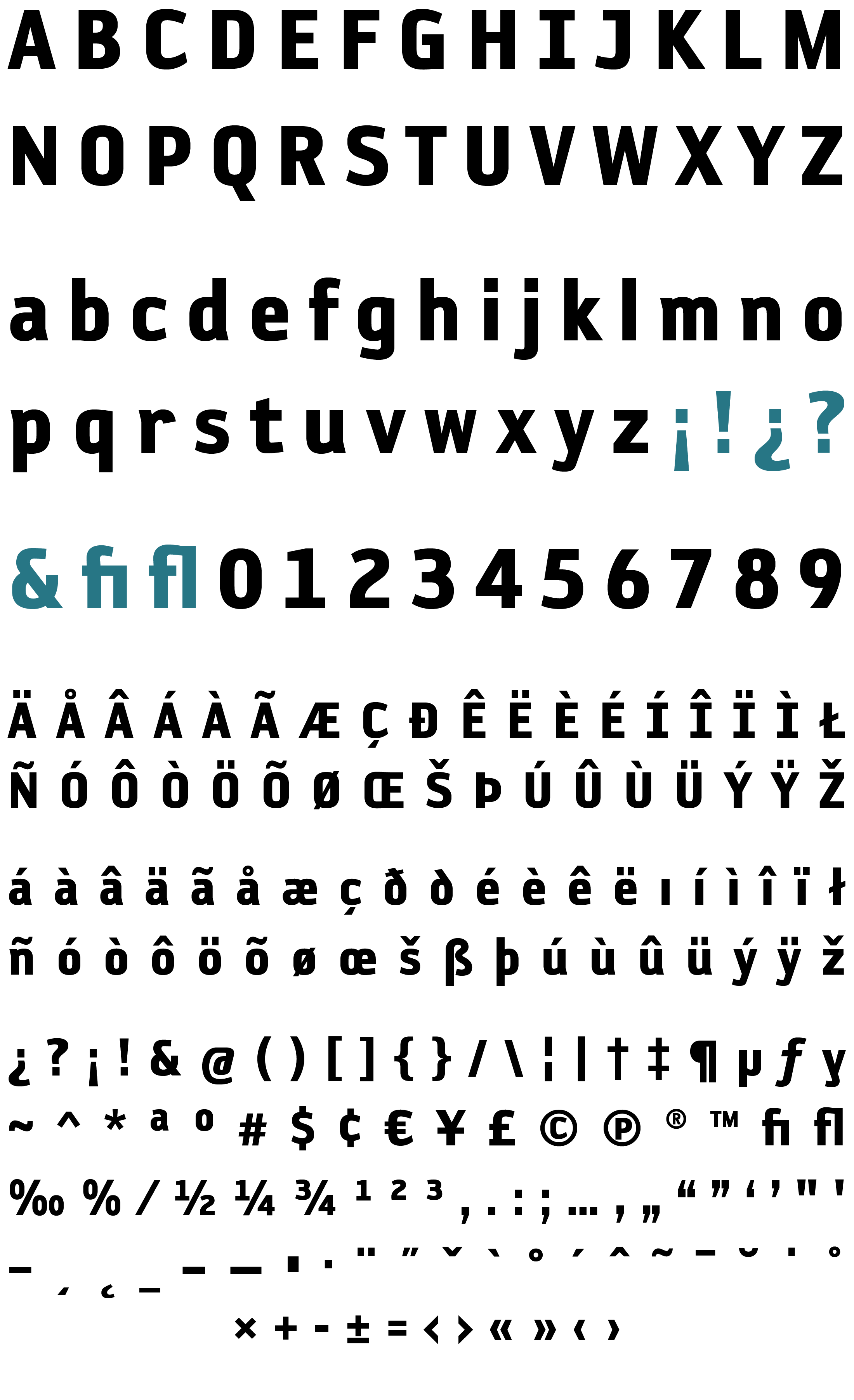
REYKJAVIK ONE D GAUGE ITALIC
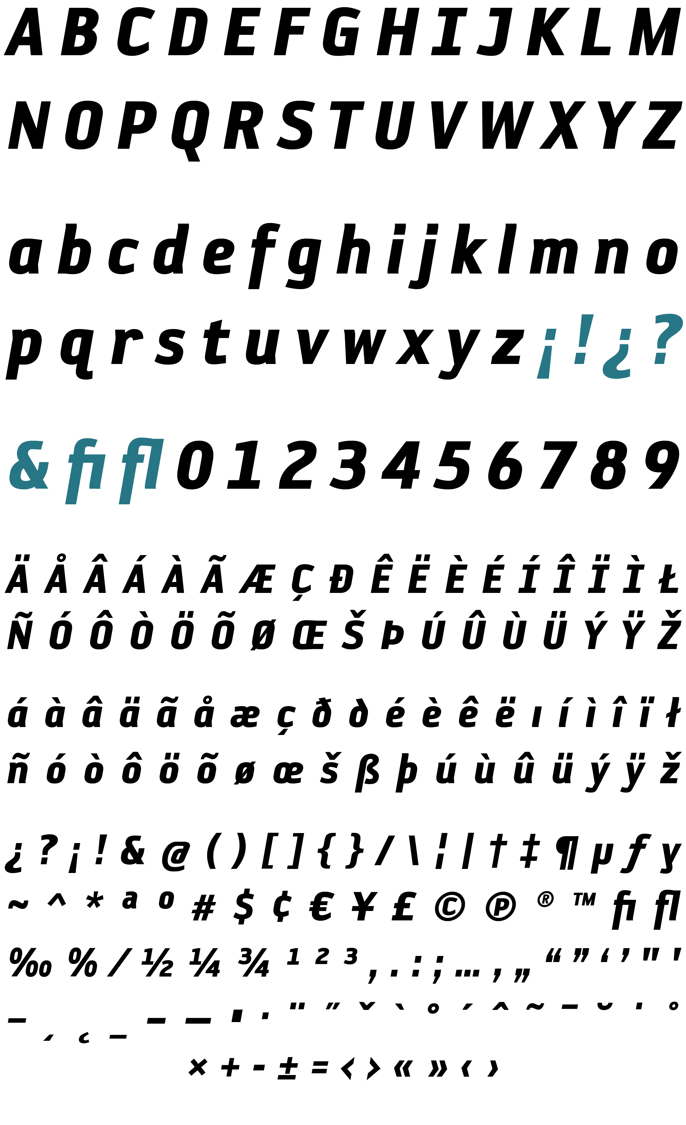
REYKJAVIK TWO CHARACTER SET
REYKJAVIK TWO A GAUGE
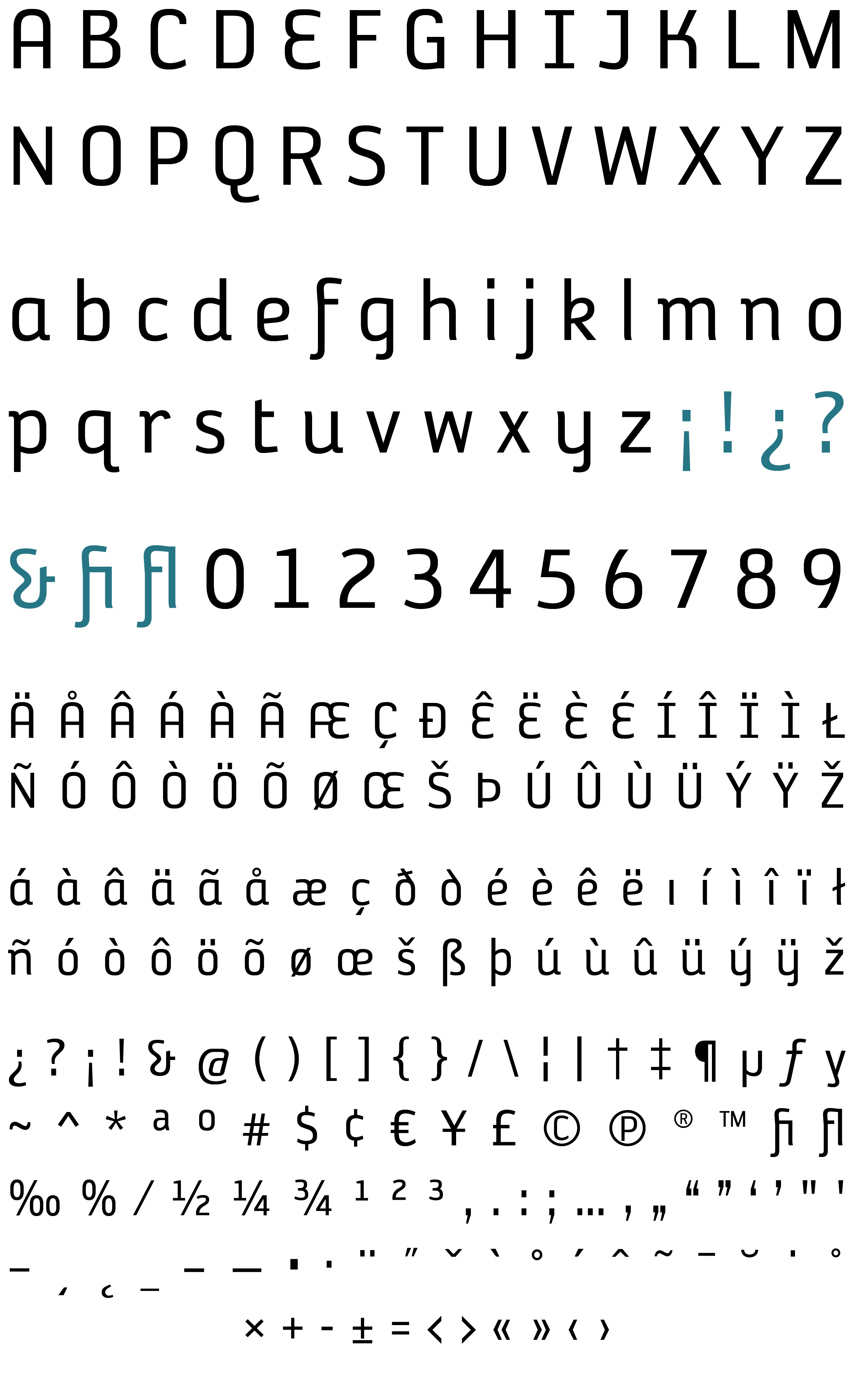
REYKJAVIK TWO A GAUGE OBLIQUE
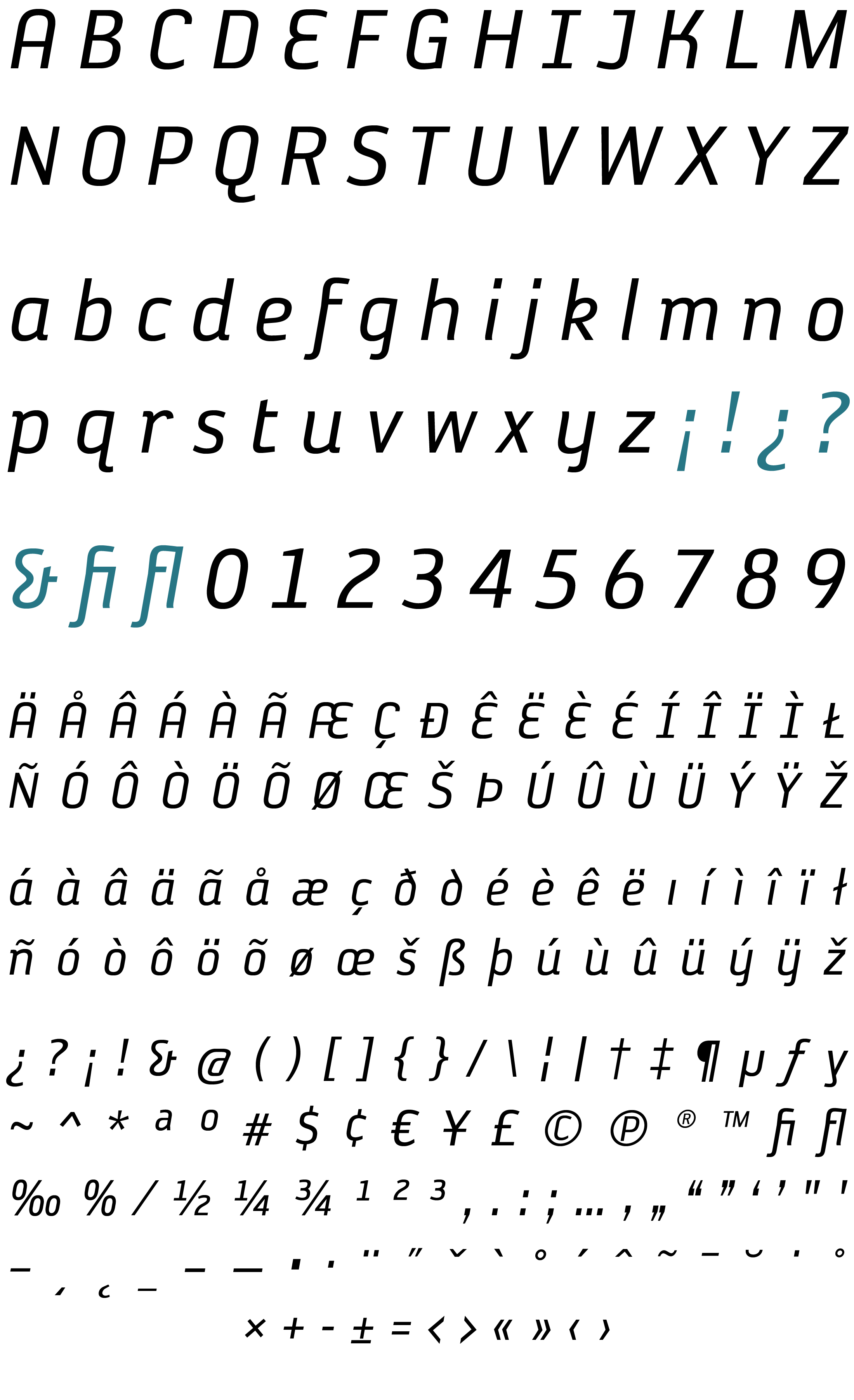
REYKJAVIK TWO B GAUGE
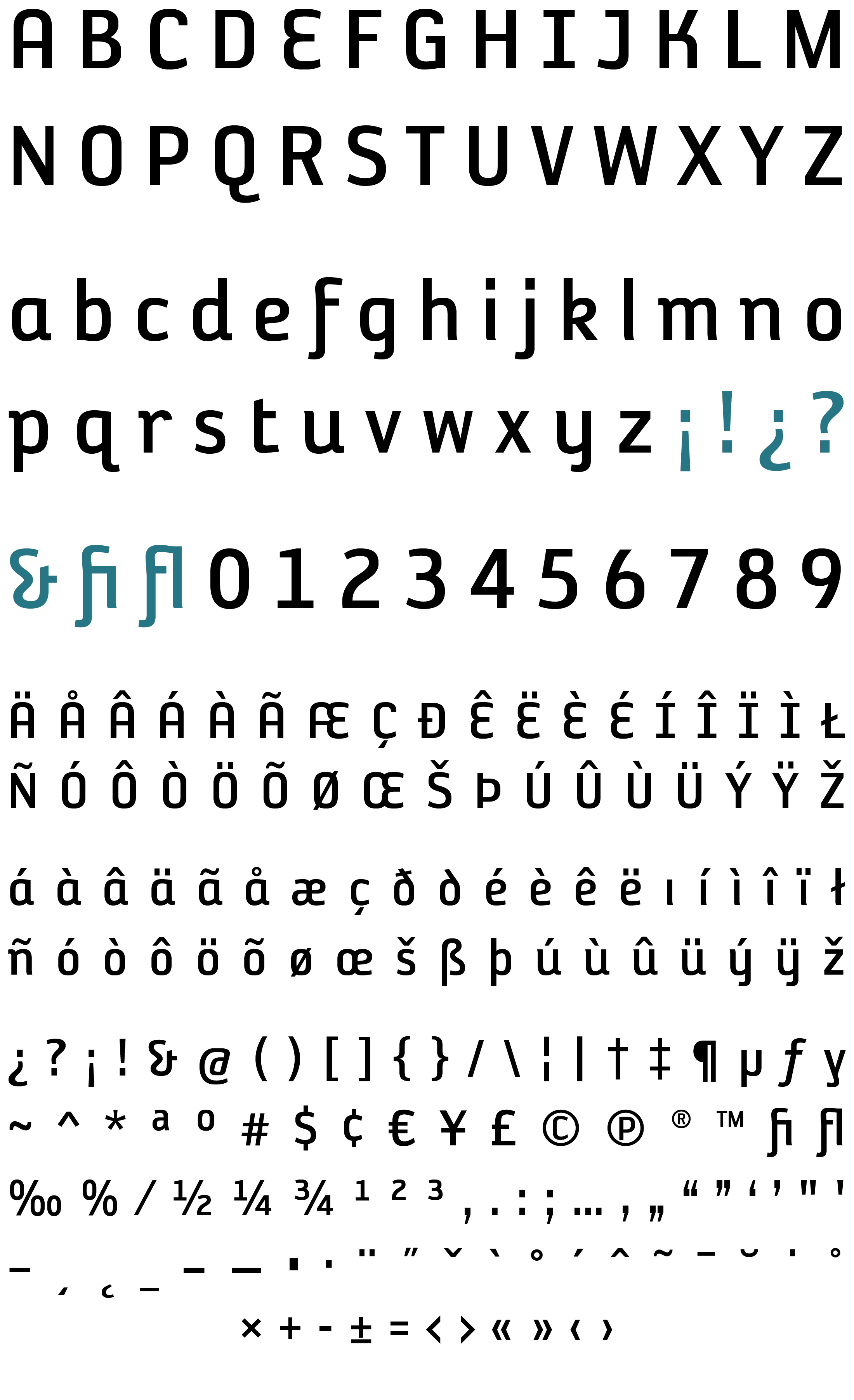
REYKJAVIK TWO B GAUGE OBLIQUE
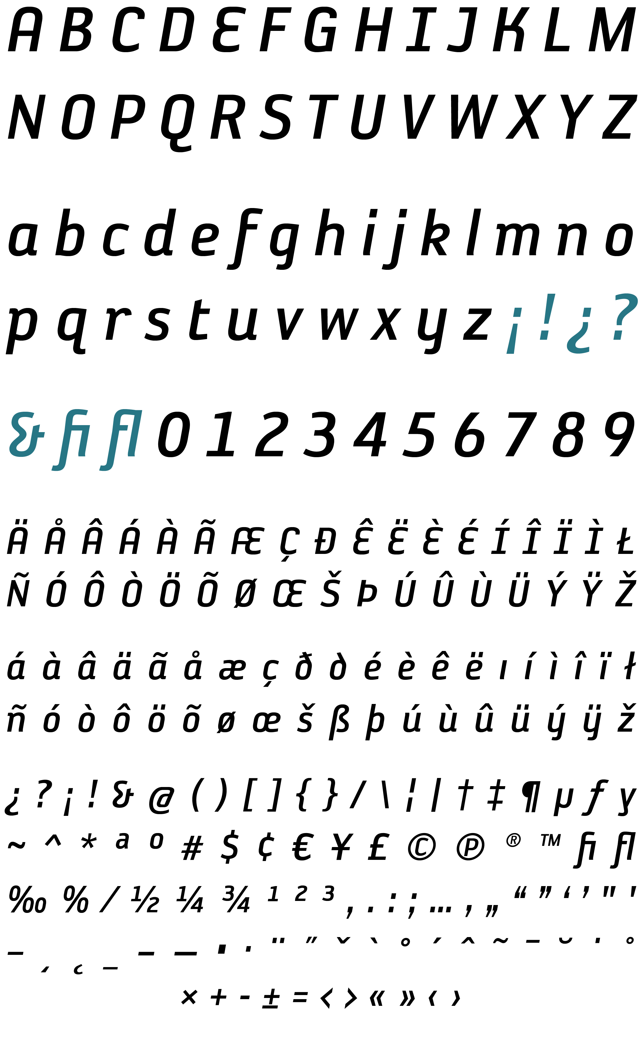
REYKJAVIK TWO C GAUGE
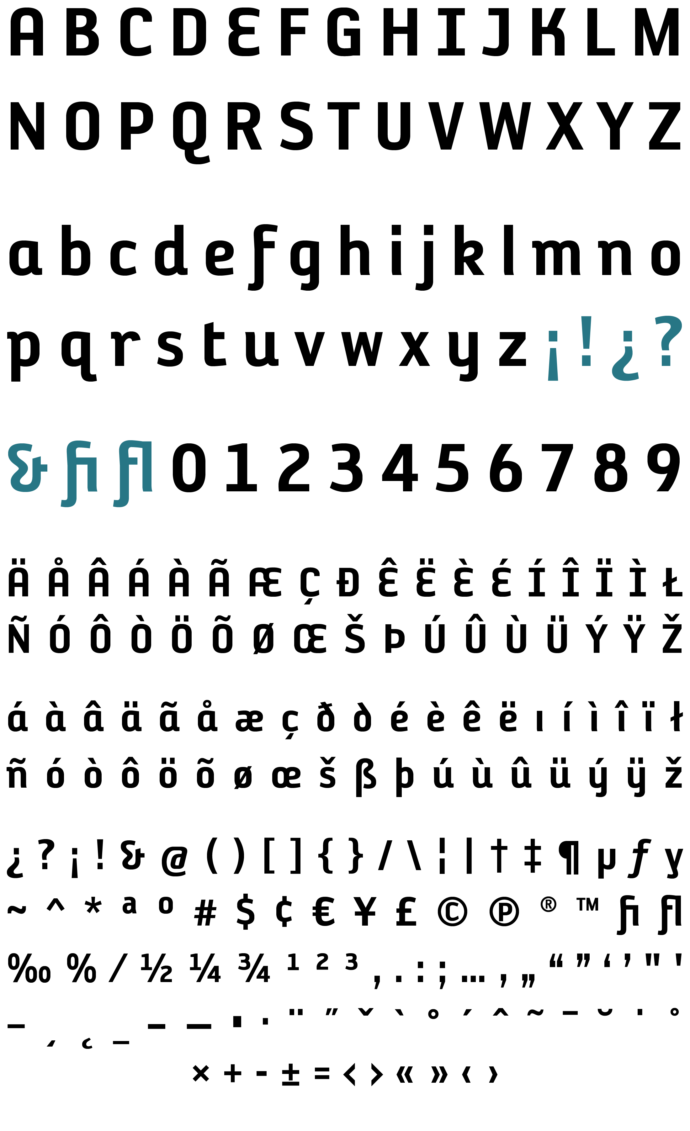
REYKJAVIK TWO C GAUGE OBLIQUE
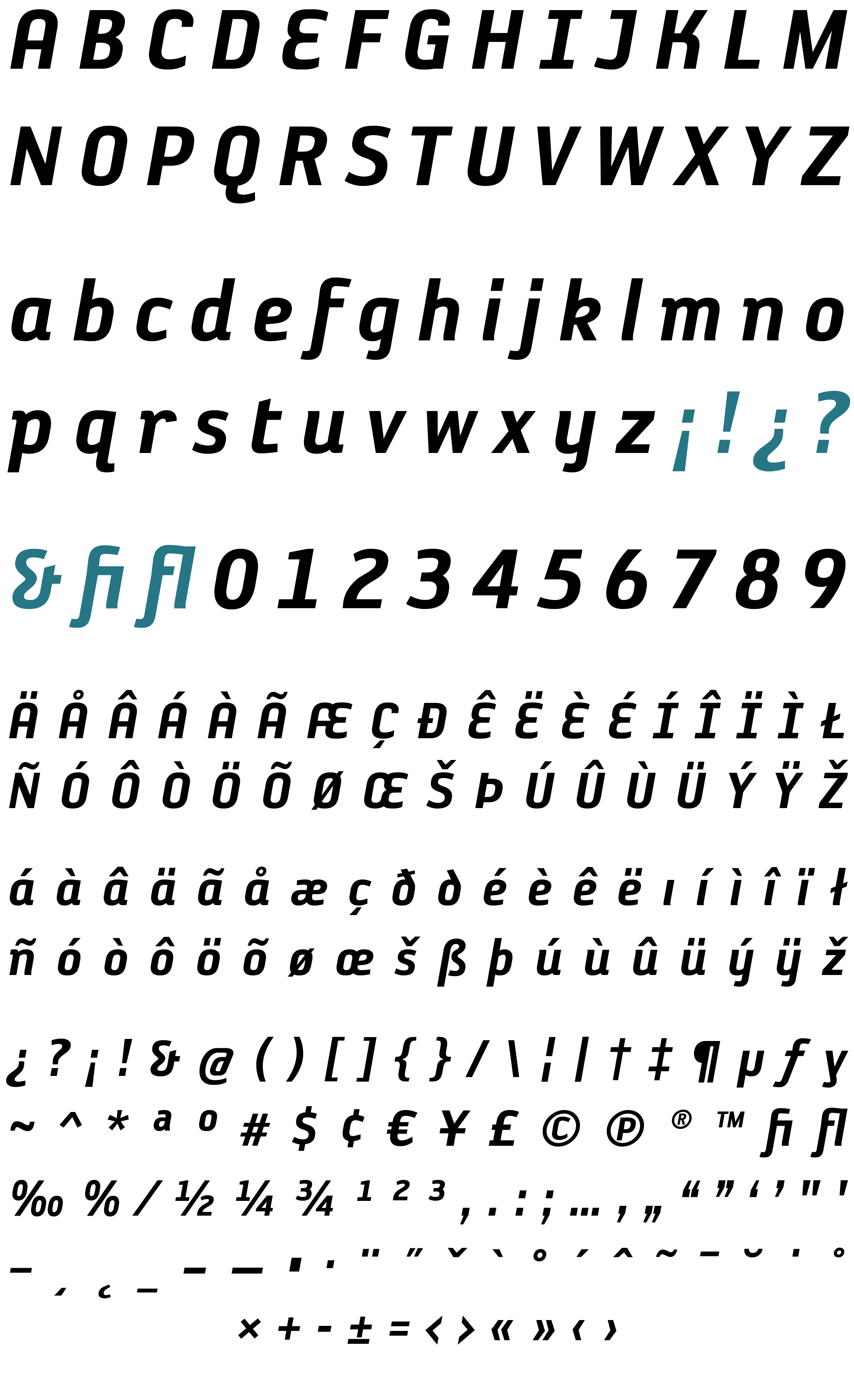
REYKJAVIK TWO D GAUGE
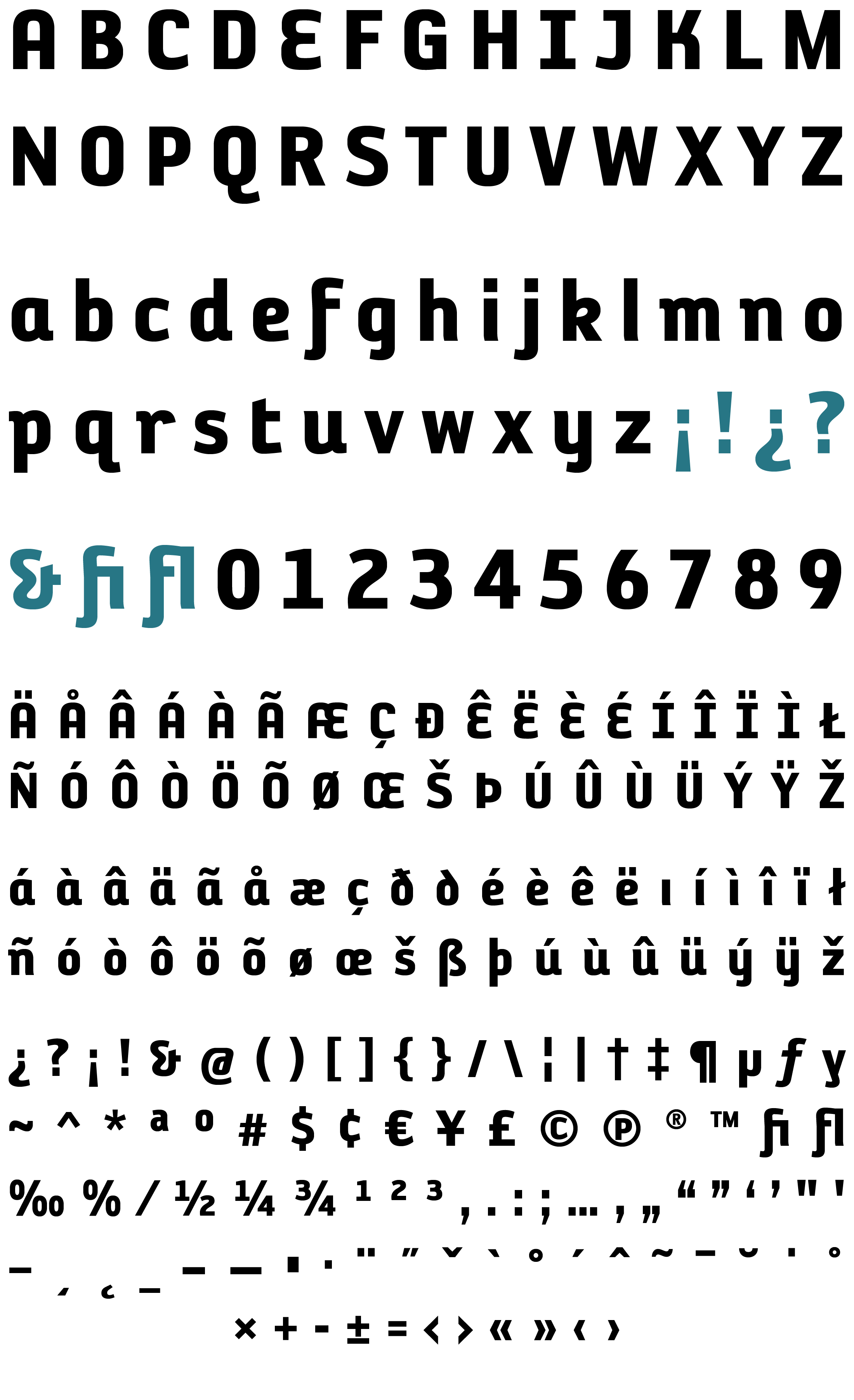
REYKJAVIK TWO D GAUGE OBLIQUE

