
GOOSEBREAK BY ANDRÉ SIMARD
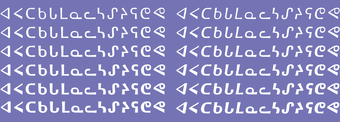
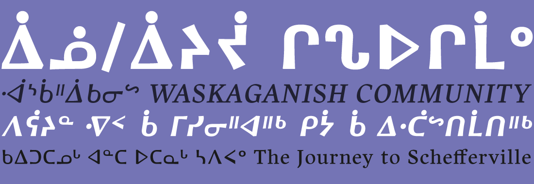
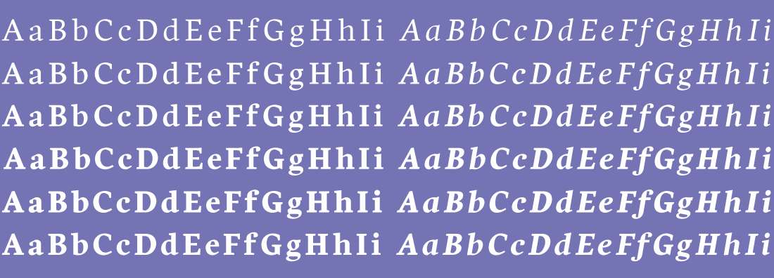
After using a few existing fonts with support for Canadian Aboriginal languages, André Simard was inspired to create his own design — something with a strong personality that evoked the forms of nature (as channeled through a calligraphers’ pen). Using his own Harfang Pro typeface as a foundation, André embarked on a multi-year journey to complete the design. The resulting 12-font family includes support for all Canadian Aboriginal languages, and is suitable for both editorial writing and advertising.
The name Goosebreak refers to the Spring goose-hunting season (‘nituwaaschenaanuu’ in Cree), which carries great importance to the aboriginal communities of Northern Quebec.


TYPE TESTER
The five boxing wizards jump quickly.