KAROLIN DESIGNED BY LARS BERGQUIST
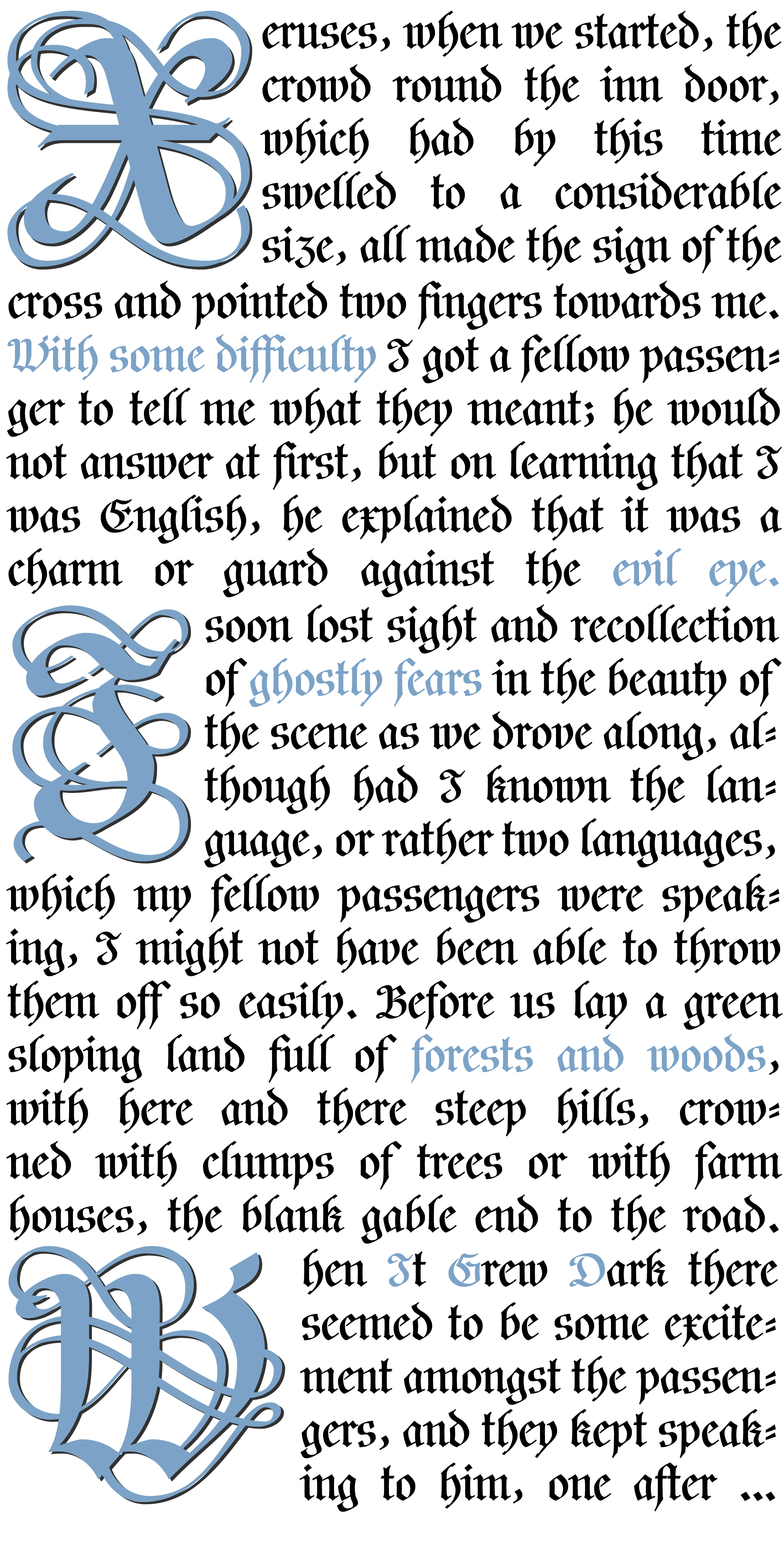
The Karolin typeface is a revival of sorts: its historical model is the calligraphed and then woodcut titling of the Swedish King Charles XII’s Bible, printed in 1703. This is a strict, almost severe late Baroque Fraktur, and the more legible for that.
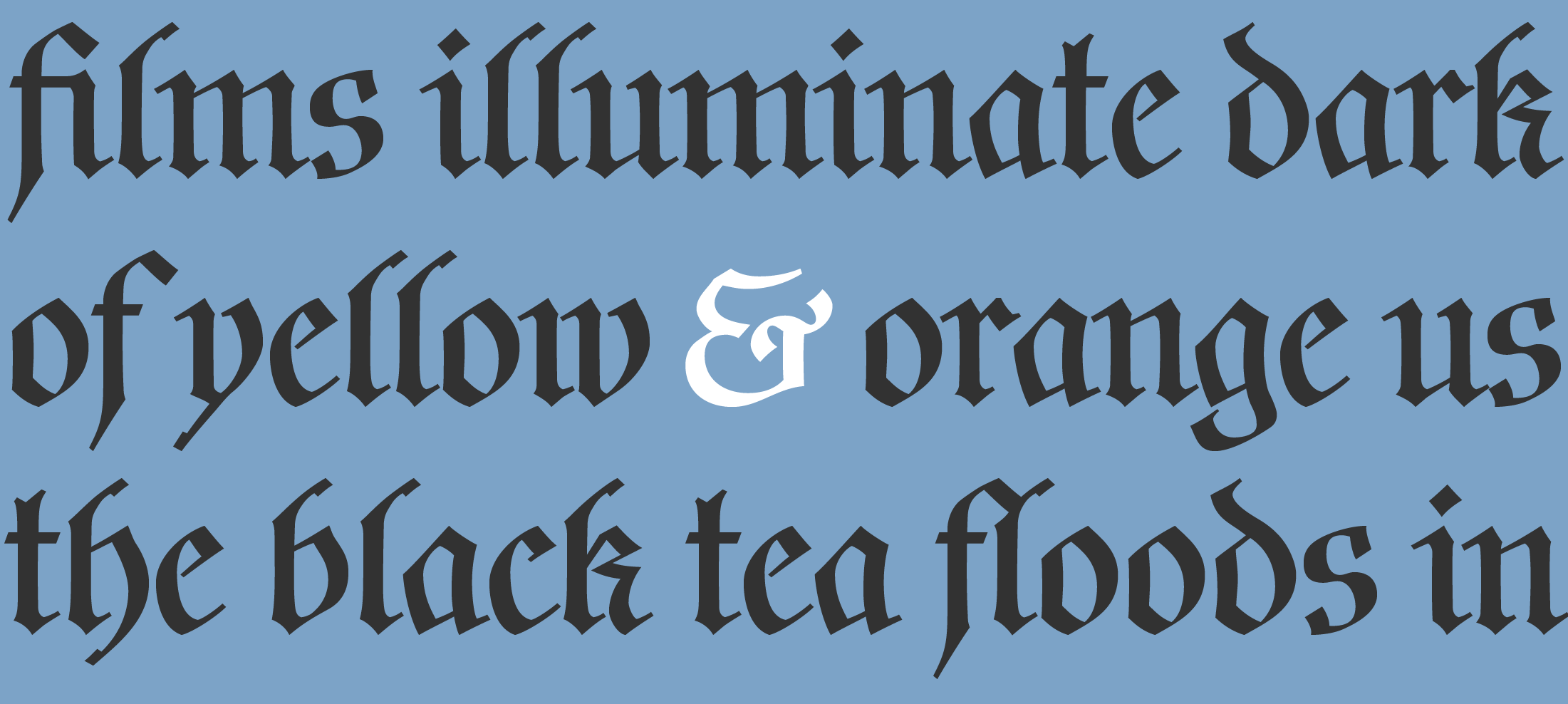
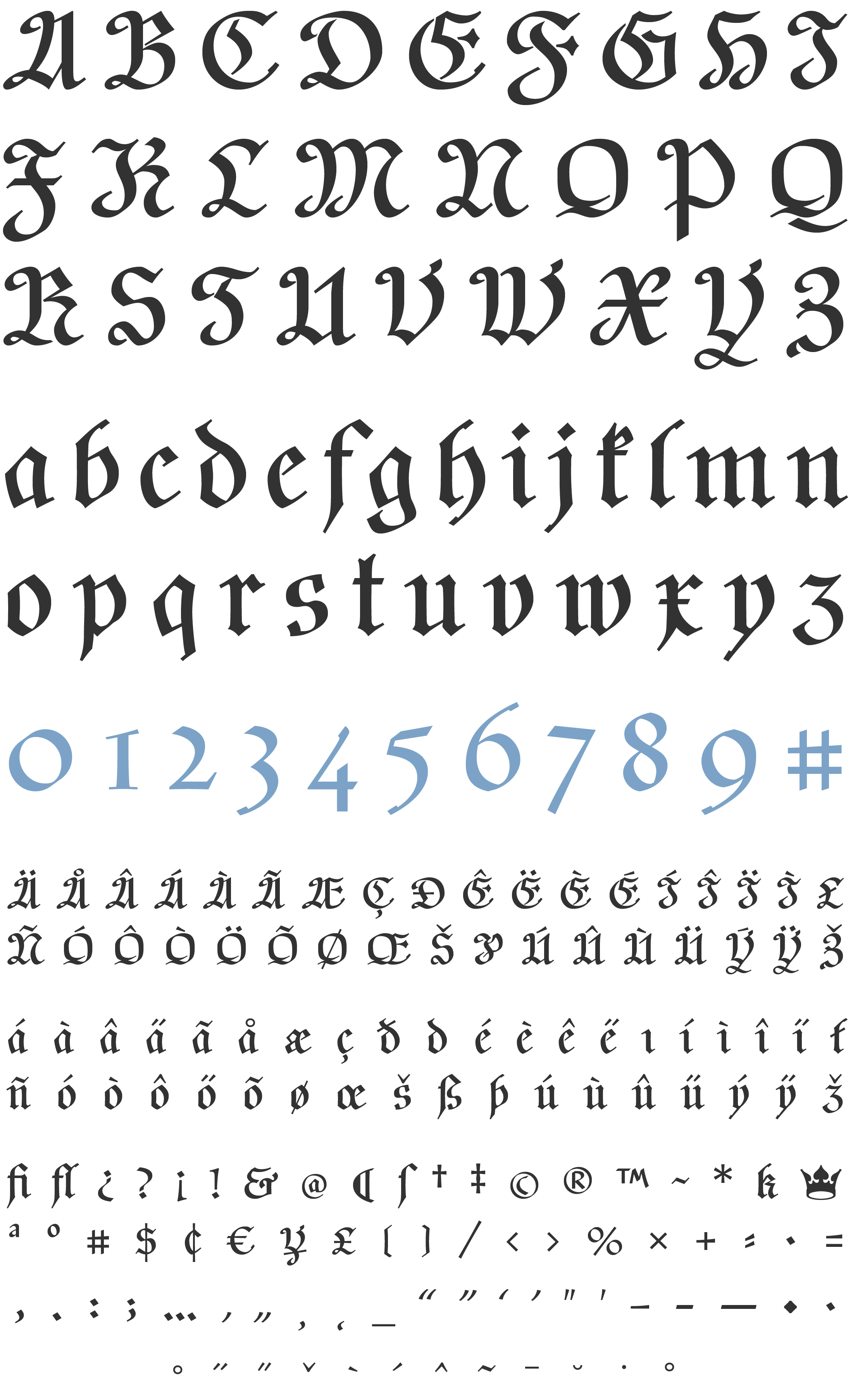
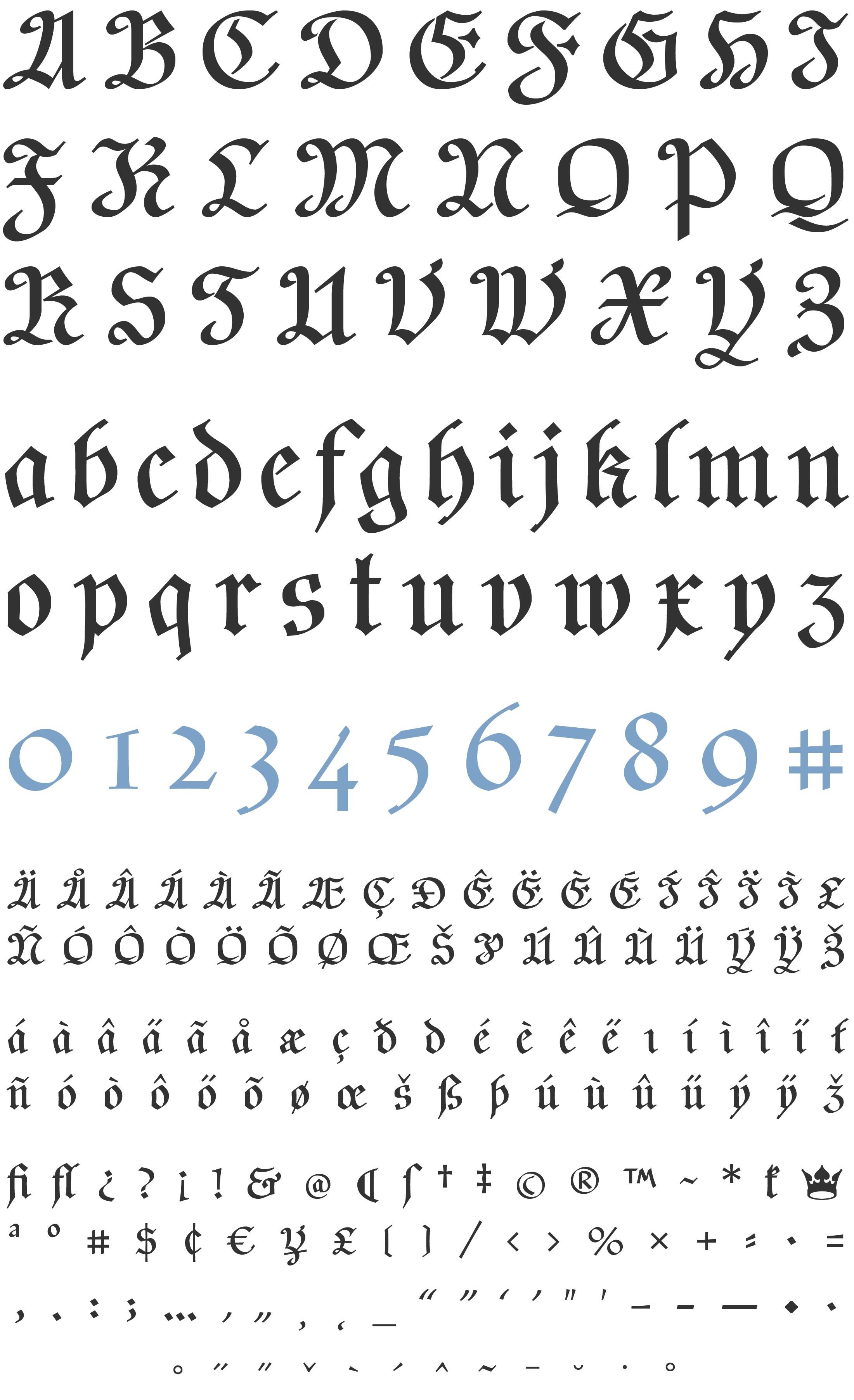
In the regular Fraktur fonts are found both the traditional ‘long s’, and a modernized ‘k’ as an alternative to the now unfamiliar traditional form. Mild variants of the ‘d’ and ‘z’also included.
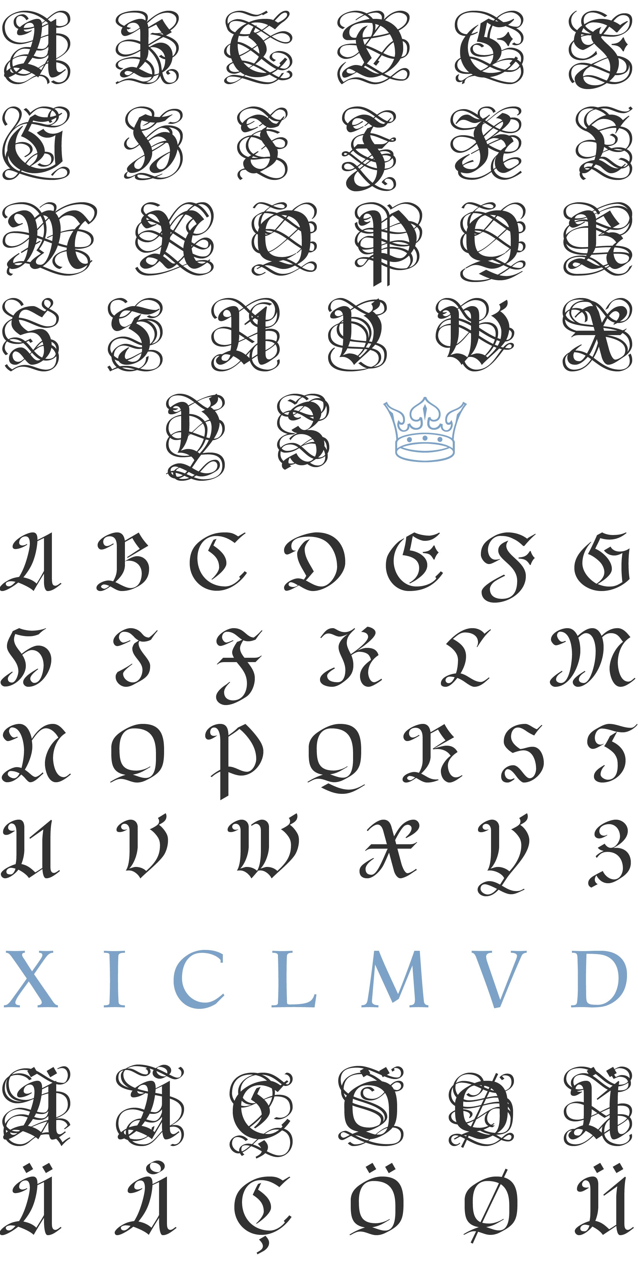
Two sets of initial caps are available in the Versal font, one of them decorated, to add the occasional touch of pomp beloved by this militaristic age, as a change from its regular diet of stale black bread and cannonballs.
All the caps have been cleaned up for better legibility in this roman-dominated age. Trifles like the © @ $ & have also been built to facilitate contemporary usage.
The Karolin Fraktur fonts include: Extended Western and Eastern European characters, Ligatures, and more. The Versal font includes: Two sets of Decorative Caps, Stylistic Alternates, and Roman Numerals.
TYPE TESTER
The five boxing wizards jump quickly
KAROLIN CHARACTER SET
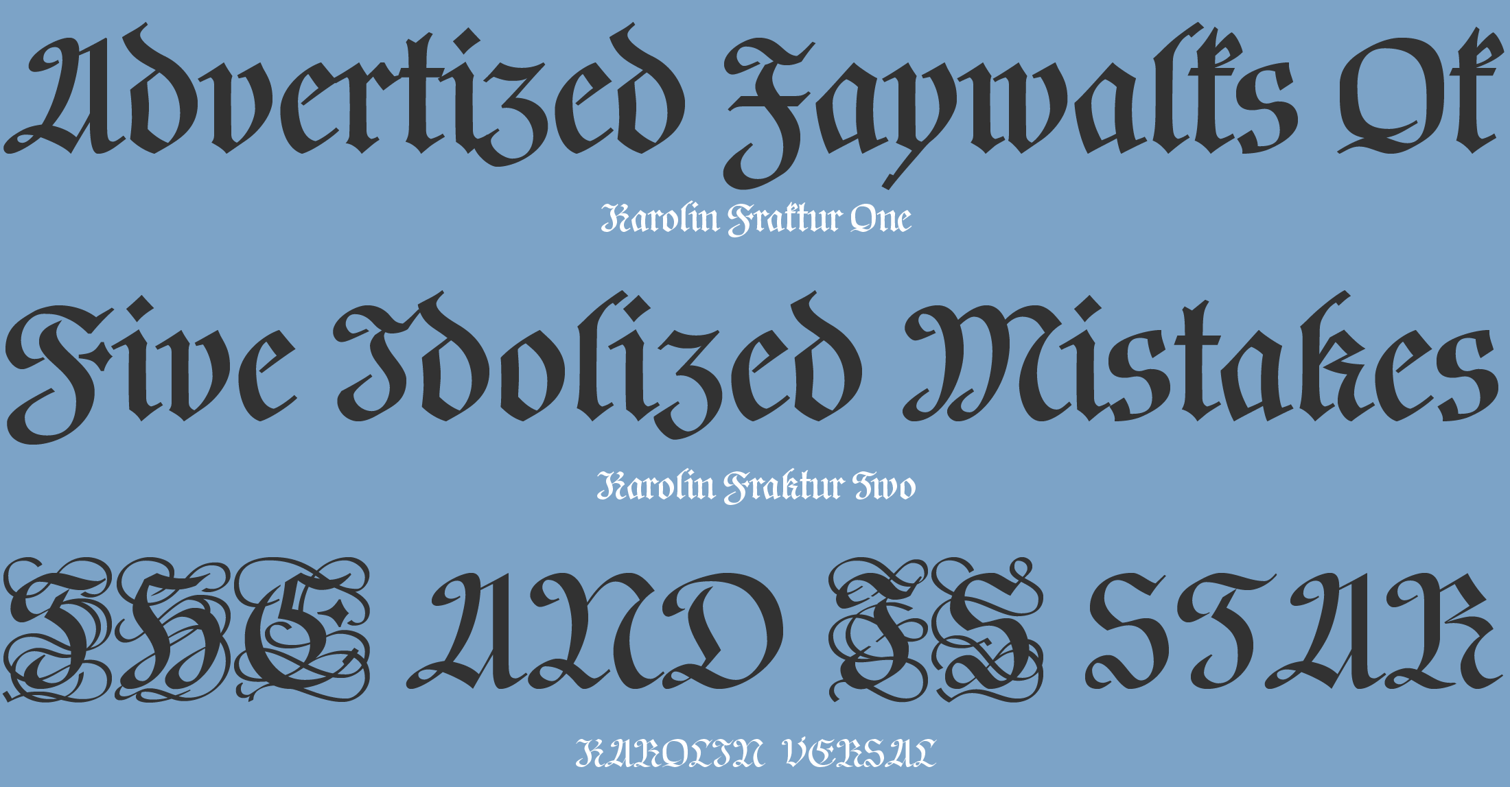
KAROLIN FRAKTUR ONE
KAROLIN FRAKTUR TWO
KAROLIN VERSAL
