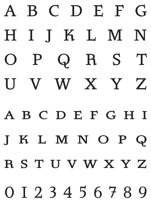
LUMINANCE BY STEFAN HATTENBACH
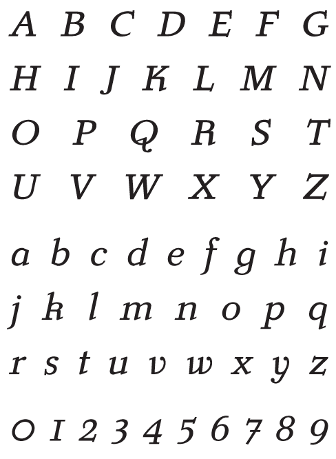
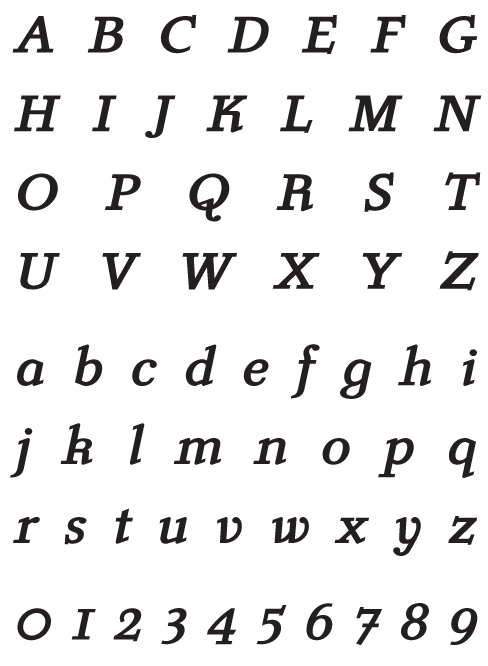
Originally made by the Chech type designer Carl Pracht in 1941-43. Having a rather calligraphic style both in regular and italic, designer Stefan Hattenbach prefered it to be more straight forward and modern looking. The italic version was executed with “traditional italic letters” (a, f, g, k, v, w and y). The numerals were made in a classic manner as “Old Style Figures”. Could be treated as both a text- and display font.
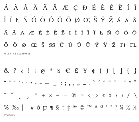
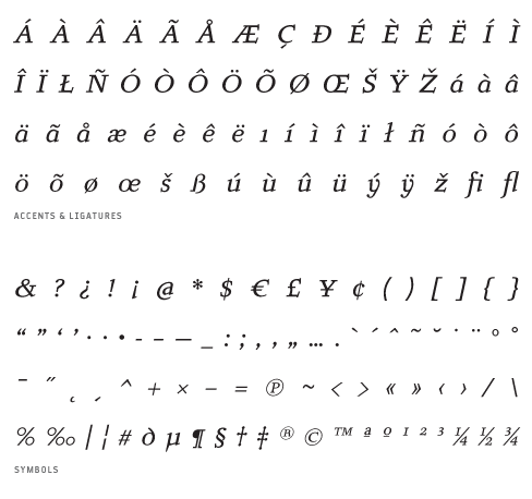
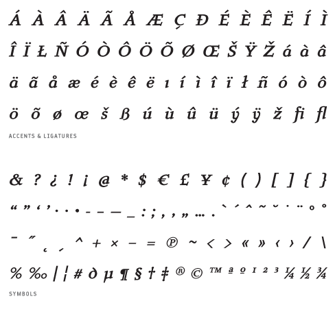
The Luminance fonts include: Western and Eastern European characters, Stylistic Alternates, ligatures, and more. A Smallcaps font is also available.
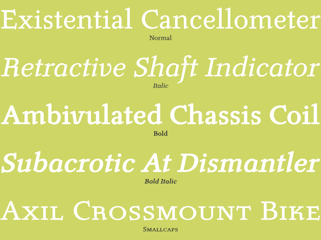
TYPE TESTER
The quick brown fox jumps over the lazy dog.
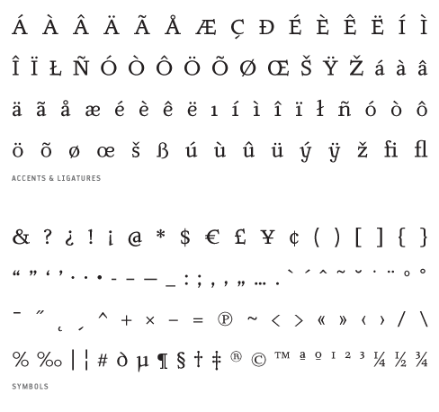
LUMINANCE CHARACTER SET
LUMINANCE NORMAL
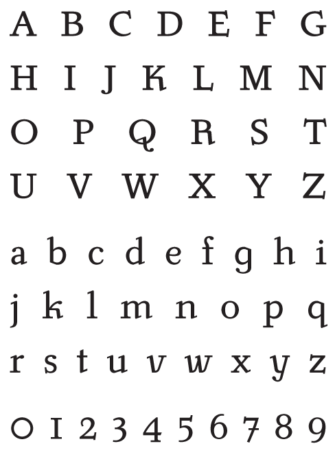
LUMINANCE ITALIC
LUMINANCE BOLD
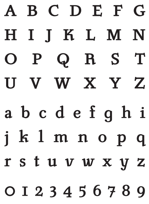
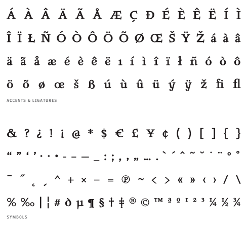
LUMINANCE BOLD ITALIC
LUMINANCE SMALLCAPS
