HARFANG PRO BY ANDRÉ SIMARD
My goal for Harfang was to create a serif typeface that would be easy to read at text sizes, while having a strong personality at larger sizes. The initial design had a purely rounded style, but with each development pass I introduced some angularity. The final result is a typeface that is easy to read in long texts, advertising copy, annual reports and the like; but one that also provides a crisp and stylish appeal in more prominent display settings.
I choose the name Harfang (Harfang des neiges — Snowy Owl or Great White Owl) because after my first typeface, Migration, I wanted something with a thematic relation. On a more personal level, Harfang is the official bird of Québec, a country with a long winter and a wonderful, white landscape, and the place I call home. —André Simard
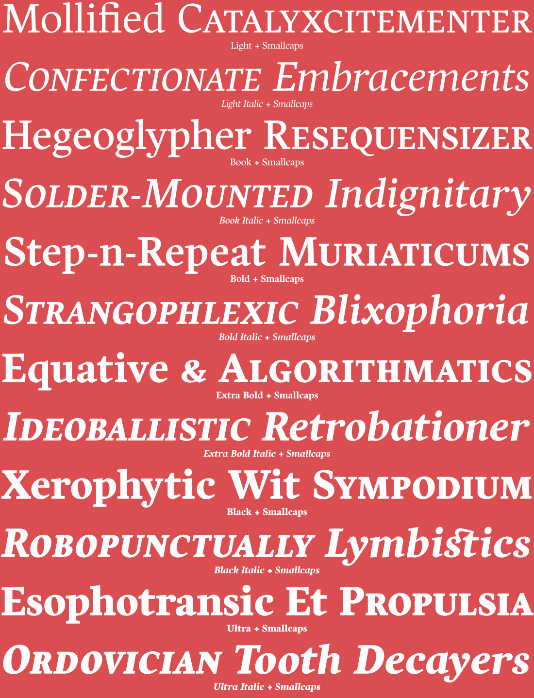
A Complete Set of all 12 fonts is available along with two subsets. Harfang Roman subset contains all 6 upright fonts, and Harfang Italic subset contains all 6 italic fonts. Each Harfang font includes: Extended Western and Eastern European characters, Smallcaps, Stylistic Alternates, Ligatures, Discretionary Ligatures, Mathematical Symbols, Lining Figures/Numerals, Oldstyle Figures/Numerals, and more.


TYPE TESTER
The five boxing wizards jump quickly.
HARFANG CHARACTER SET
HARFANG LIGHT

HARFANG LIGHT ITALIC

HARFANG BOOK

HARFANG BOOK ITALIC

HARFANG BOLD

HARFANG BOLD ITALIC

HARFANG EXTRA BOLD

HARFANG EXTRA BOLD ITALIC

HARFANG BLACK

HARFANG BLACK ITALIC

HARFANG ULTRA

HARFANG ULTRA ITALIC


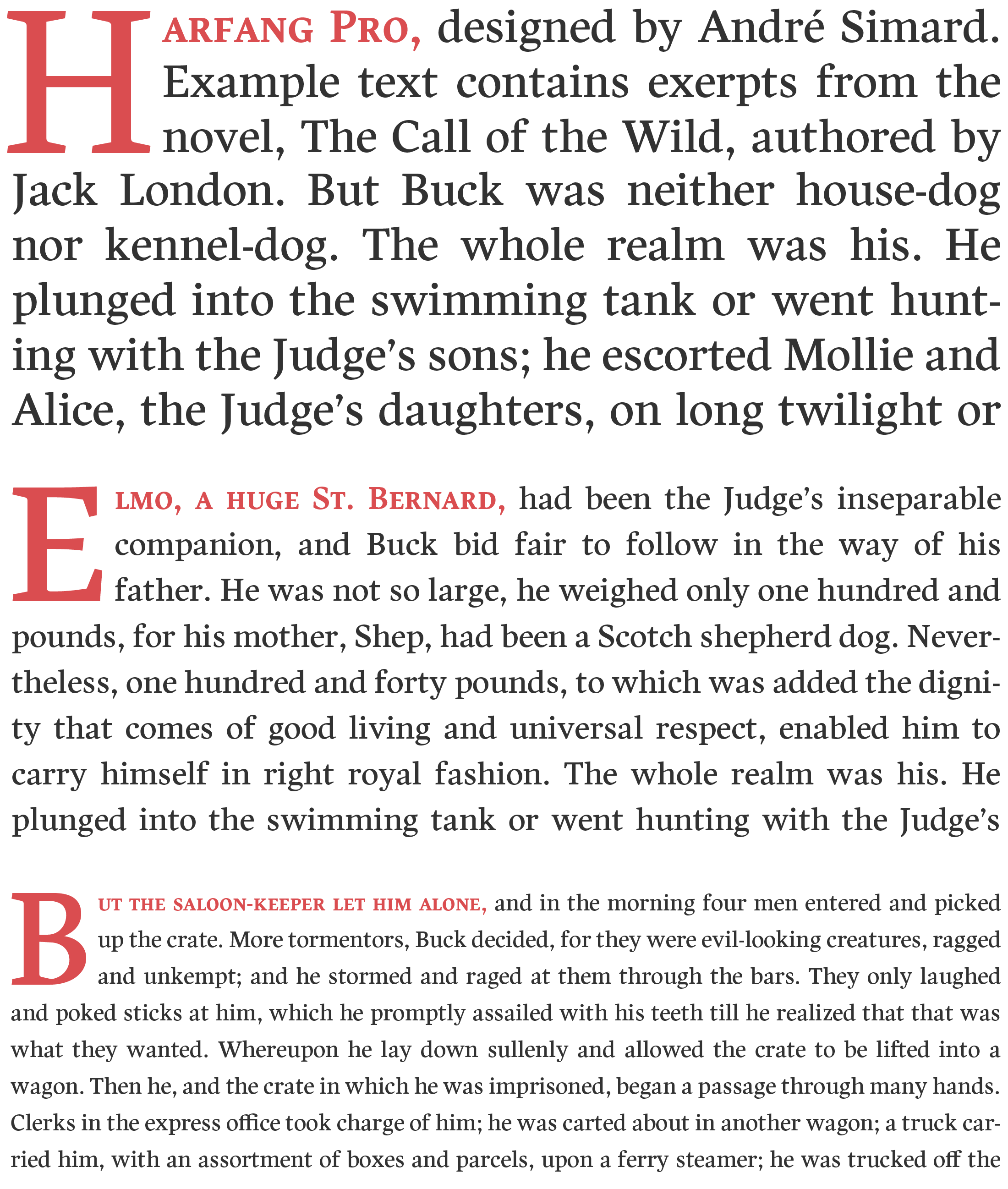
HARFANG UPRIGHT TEXT SAMPLE

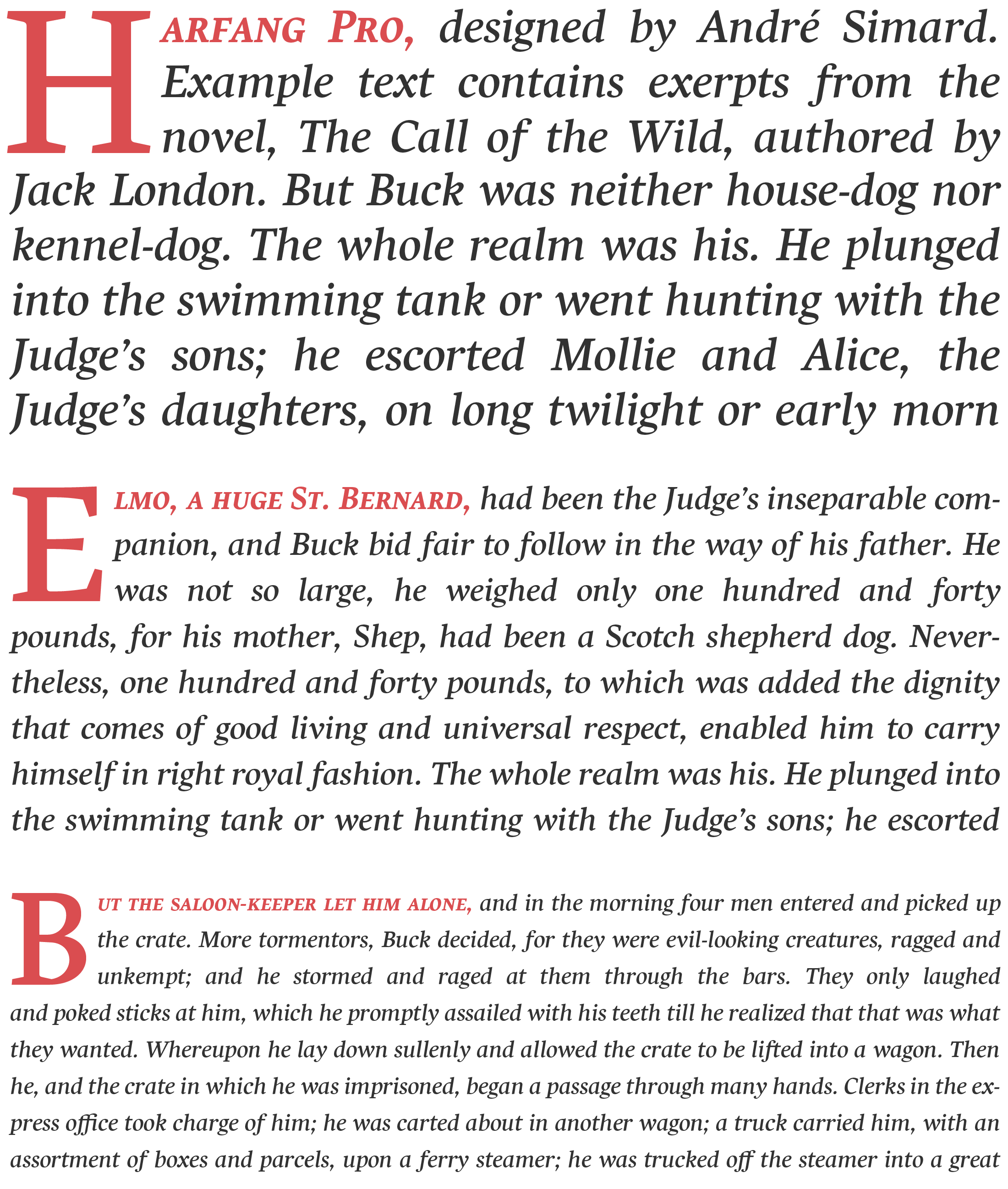
HARFANG ITALIC TEXT SAMPLE
